Beyond Dynamite Plots: Visualizing Data Distributions
Box Plots, Violin Plots, and Raincloud Plots in R
Abstract
This lesson explores effective data visualization techniques using the HbmassSynth dataset from the speedsR package. Moving beyond the limitations of dynamite plots, we delve into box plots, violin plots, and raincloud plots to uncover meaningful insights into data distributions. By the end of this lesson, learners will gain hands-on experience in constructing and interpreting these visualizations using R.
The level of this lesson is categorized as BRONZE.
Lesson’s Main Idea
Understanding the limitations of dynamite plots and transitioning to better alternatives.
Gaining proficiency in creating box plots, violin plots, and raincloud plots in R.
Leveraging these visualizations to interpret data distributions and enhance data-driven decision-making.
Dataset Used In This Lesson
In this lesson, we use the HbmassSynth dataset from the speedsR package, an R data package specifically designed for the SPEEDS project. This package provides a collection of sports-specific datasets, streamlining access for analysis and research in the sports science context. The HbmassSynth dataset offers valuable insights into the effects of moderate altitude exposure and iron supplementation on hematological variables in endurance athletes.
1 Learning Outcomes
By the end of this lesson, you will have developed the ability to:
Understand the Limitations of Dynamite Plots: Recognize the shortcomings of dynamite plots and explain why alternative visualizations are more effective for representing data distributions.
Create Box Plots in R: Construct box plots using the ggplot2 package to visualize medians, quartiles, and outliers in datasets.
Develop Violin Plots: Build violin plots to represent the full distribution of data and identify subtle patterns or multimodal distributions.
Combine Violin and Box Plots: Integrate violin and box plots to present density, distribution, and summary statistics in a single visualization.
Design Raincloud Plots: Construct raincloud plots using both the ggdist and raincloudplots packages to merge density, raw data points, and statistical summaries effectively.
Compare Visualization Methods: Evaluate and choose between visualization techniques based on the dataset and analytical goals.
2 Introduction
In data science and sports science, visualizing data distributions effectively is crucial for drawing meaningful insights. This lesson explores advanced visualization techniques that overcome the limitations of dynamite plots, emphasizing the use of box plots, violin plots, and raincloud plots. By leveraging these visualizations, you will learn to represent data distributions comprehensively, showcasing central tendencies, variability, and individual data points.
3 Loading the HbmassSynth Dataset
The HbmassSynth dataset used in this lesson can be loaded from the speedsR package, as shown below:
# Load the speedsR packagelibrary(speedsR)# Access and assign the dataset to a variablehbmass_data <- HbmassSynth# View the first few rows of the dataset to understand its structurehead(hbmass_data)
This code snippet loads the HbmassSynth dataset and displays its first few rows, providing a preview of the data’s structure and the types of variables it contains.
4 Dynamite Plots: Why to Avoid Them
Dynamite plots, also known as bar charts with error bars, are commonly used in scientific publications to display means and standard errors or standard deviations for groups. However, they are highly criticized for being uninformative and misleading.
Why dynamite plots should be avoided:
Lack of Data Representation: Dynamite plots show only the mean and variability, concealing the actual distribution of the data. This makes it impossible to discern key features such as:
Presence of outliers.
Multimodal distributions.
The number of data points per group.
Misleading Visual Impact: The height of the bars in dynamite plots creates a false sense of precision and uniformity. The visual weight of the bars can exaggerate small differences between means, potentially leading to incorrect interpretations.
Hiding Sample Size: Dynamite plots do not show how many data points contributed to the calculation of the mean, making it difficult to assess the reliability of the summary statistics.
Better Alternatives Exist: Plots like box plots, violin plots, and raincloud plots can display much more information, such as the full distribution of the data, median values, and variability, making them far superior for data visualization.
4.1 Example
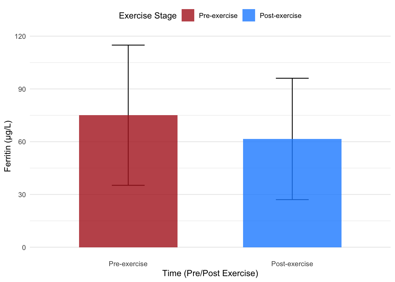
Using the FER (Ferritin) variable from the HbmassSynth dataset, consider the following dynamite plot, which displays the mean ferritin levels for two groups (e.g., pre-exercise vs. post-exercise):
# Load necessary librarieslibrary(dplyr) # For data manipulationlibrary(ggplot2) # For plotting# Set random seed for reproducibility across all plotsset.seed(42)# Filter out NA values from the TIME columnhbmass_data_clean <- hbmass_data %>%filter(!is.na(TIME))# Convert TIME to a factor and relabel levelshbmass_data_clean$TIME <-factor(hbmass_data_clean$TIME, labels =c("Pre-exercise", "Post-exercise"))# Calculate mean and standard deviation explicitlysummary_stats <- hbmass_data_clean %>%group_by(TIME) %>%summarise(mean =mean(FER, na.rm =TRUE),sd =sd(FER, na.rm =TRUE),.groups ="drop" )# Dynamite plot with error barsggplot(summary_stats, aes(x = TIME, y = mean, fill = TIME)) +geom_errorbar(aes(ymin = mean - sd, ymax = mean + sd),width =0.2,position =position_dodge(0.6) ) +geom_bar(stat ="identity", position ="dodge", width =0.6, alpha =0.8) +scale_fill_manual(values =c("#B22222", "#1E90FF")) +# Dark red and dark bluelabs(x ="Time (Pre/Post Exercise)",y ="Ferritin (µg/L)",fill ="Exercise Stage" ) +theme_minimal() +theme(legend.position ="top",panel.grid.major.x =element_blank(),panel.grid.minor.x =element_blank() )
While this plot shows the mean and standard deviation for ferritin levels, it fails to reveal how the values are distributed within each group. Are the data points evenly spread out? Are there outliers? None of this critical information is visible in a dynamite plot.
4.2 Recommendation:
Avoid dynamite plots and instead use visualizations that display the raw data alongside summary statistics. For example:
Box plots: Highlight median, quartiles, and potential outliers.
Violin plots: Show the density of the data distribution.
Raincloud plots: Combine density, summary statistics, and raw data points.
By using these alternatives, you provide a clearer and more accurate representation of the data, making it easier for viewers to understand the underlying patterns and variability.
5 Box Plots: A Fundamental Visualization Tool
In the previous section, we explored the shortcomings of dynamite plots and highlighted their inability to reveal the full distribution of data. As we transition to box plots, we introduce a visualization that addresses these limitations by summarizing key distributional statistics while offering insights into variability and potential outliers.
5.1 Why Use Box Plots?
Box plots are excellent for comparing distributions across groups or conditions. They provide a concise summary of data by visualizing:
The median, offering a measure of central tendency.
The interquartile range (IQR), capturing the spread of the middle 50% of the data.
Whiskers, showing the range within 1.5 times the IQR from Q1 (25th percentile) and Q3 (75th percentile).
Outliers, which fall outside the whiskers and may indicate unusual or interesting data points.
By focusing on these features, box plots are ideal for identifying differences and similarities between groups, making them invaluable in experimental analysis.
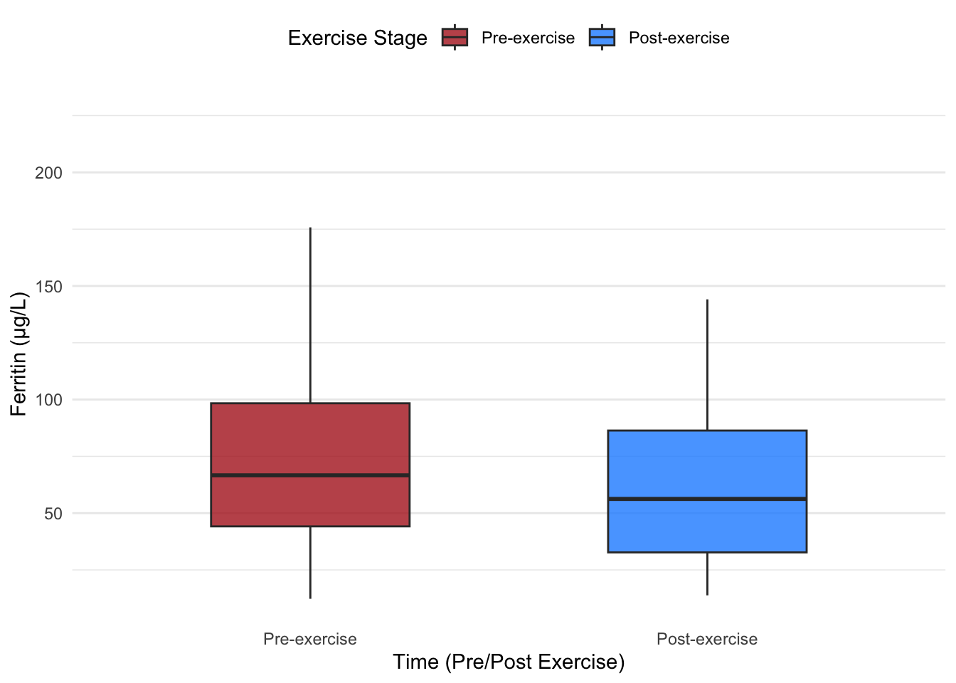
5.2 Example: Box Plots Without and With Data Points
We will now create box plots using the ferritin (FER) variable from the dataset to compare pre- and post-exercise distributions. First, we’ll plot the box plot without data points, then overlay the data points to illustrate individual observations.
# Box plot without data pointsggplot(hbmass_data_clean, aes(x = TIME, y = FER, fill = TIME)) +geom_boxplot(width =0.5, alpha =0.8, outlier.shape =NA) +# Suppress default outlier pointsscale_fill_manual(values =c("#B22222", "#1E90FF")) +# Dark red and dark bluelabs(x ="Time (Pre/Post Exercise)",y ="Ferritin (µg/L)",fill ="Exercise Stage" ) +theme_minimal() +theme(legend.position ="top",panel.grid.major.x =element_blank(),panel.grid.minor.x =element_blank() )
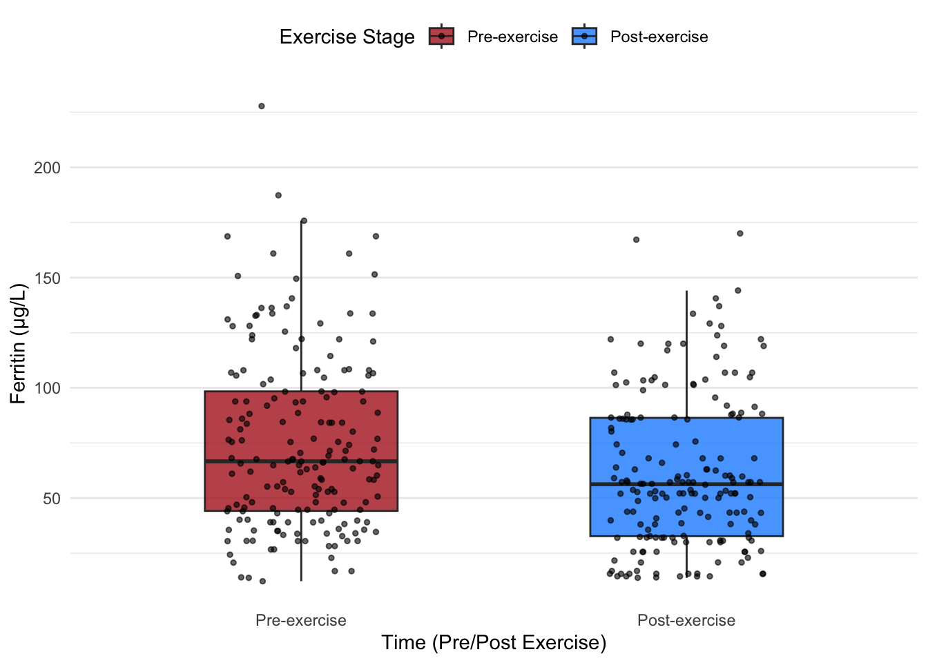
Next, we add data points for a more detailed view:
# Box plot with data pointsggplot(hbmass_data_clean, aes(x = TIME, y = FER, fill = TIME)) +geom_boxplot(width =0.5, alpha =0.8, outlier.shape =NA) +# Box plotgeom_jitter(width =0.2, size =1, alpha =0.6, color ="black") +# Add jittered data pointsscale_fill_manual(values =c("#B22222", "#1E90FF")) +# Dark red and dark bluelabs(x ="Time (Pre/Post Exercise)",y ="Ferritin (µg/L)",fill ="Exercise Stage" ) +theme_minimal() +theme(legend.position ="top",panel.grid.major.x =element_blank(),panel.grid.minor.x =element_blank() )
5.2.1 Benefits of Adding Data Points
Adding individual data points to a box plot reveals:
Data density: Clusters of points indicate higher density areas, while gaps suggest sparse data.
Outliers’ details: The exact position of outliers is shown, providing more context.
Variation: Highlights the variability within and between groups.
By combining the structure of box plots with the granularity of data points, we obtain a richer understanding of the data’s distribution and its nuances.
Box plots provide a balance between simplicity and informativeness, making them indispensable for summarizing data distributions. The addition of data points enhances their utility, offering a comprehensive view of the data while maintaining clarity. In the next section, we will expand on this by introducing violin plots, which go a step further in visualizing data distributions.
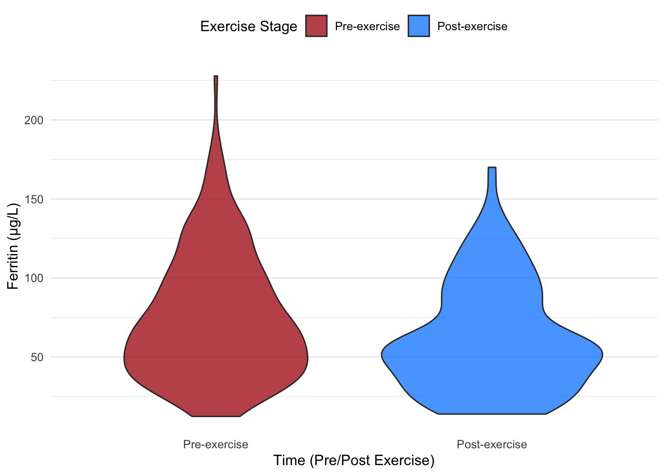
6 Violin Plots: Visualizing Full Data Distributions
Building on the insights provided by box plots, violin plots offer an additional layer of information by displaying the entire data distribution. Violin plots are especially useful for identifying multimodal distributions or skewed data, which might not be evident in box plots alone.
6.1 Why Use Violin Plots?
Violin plots provide:
A visualization of the data density across its entire range.
The ability to highlight distribution shape (e.g., unimodal, bimodal).
A compact comparison of groups, ideal for datasets with multiple categories.
While violin plots excel at displaying data distribution, they can sometimes obscure summary statistics (e.g., medians) without additional elements.
6.2 Example: Violin Plots Without and With Data Points
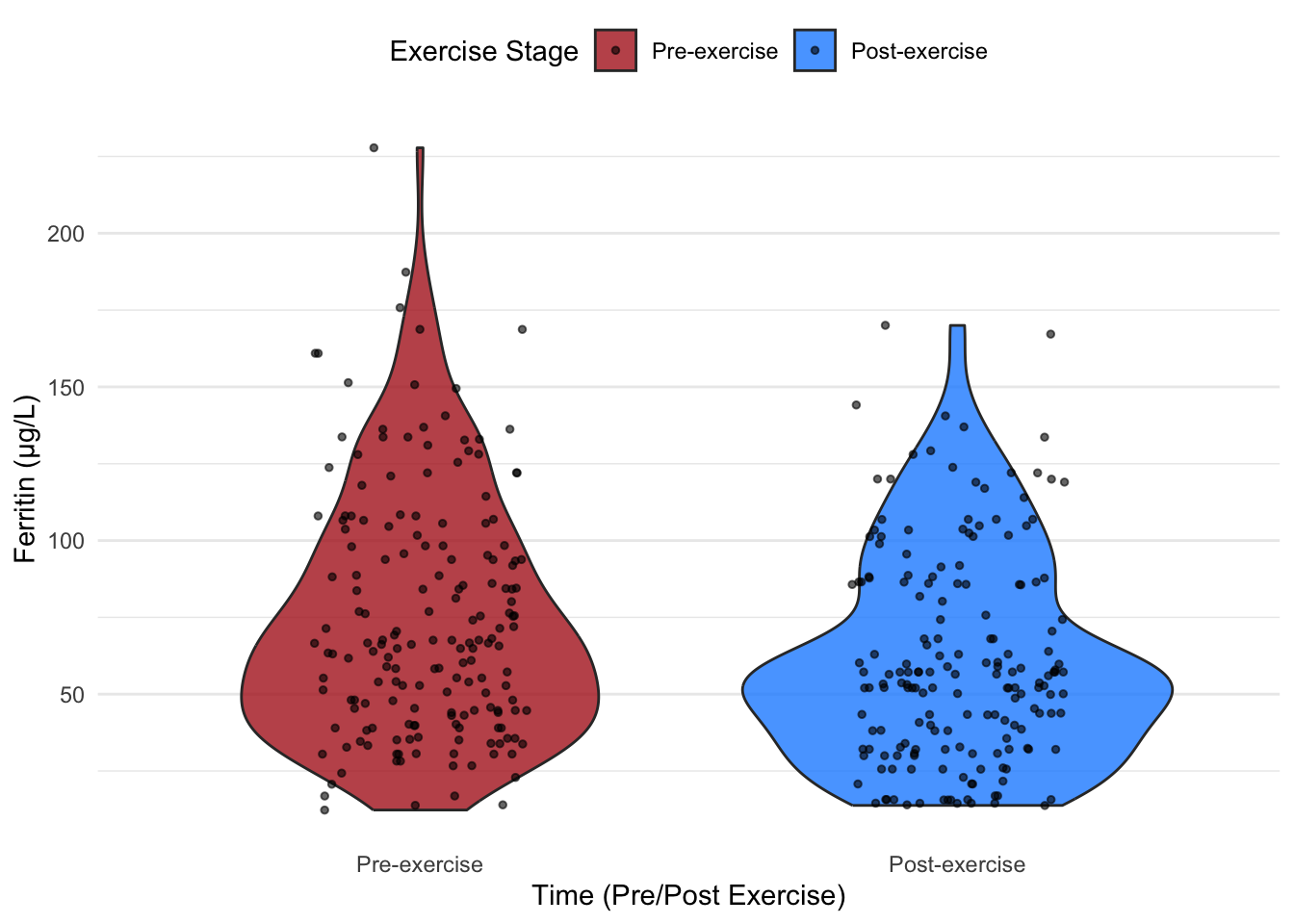
Below, we demonstrate violin plots comparing ferritin (FER) levels pre- and post-exercise. First, we create violin plots without data points, followed by plots that overlay data points for added clarity.
# Violin plot without data pointsggplot(hbmass_data_clean, aes(x = TIME, y = FER, fill = TIME)) +geom_violin(trim =TRUE, alpha =0.8, width =0.8) +# Basic violin plotscale_fill_manual(values =c("#B22222", "#1E90FF")) +# Dark red and dark bluelabs(x ="Time (Pre/Post Exercise)",y ="Ferritin (µg/L)",fill ="Exercise Stage" ) +theme_minimal() +theme(legend.position ="top",panel.grid.major.x =element_blank(),panel.grid.minor.x =element_blank() )
Adding data points:
# Violin plot with data pointsggplot(hbmass_data_clean, aes(x = TIME, y = FER, fill = TIME)) +geom_violin(trim =TRUE, alpha =0.8, width =0.8) +# Violin plotgeom_jitter(width =0.2, size =1, alpha =0.6, color ="black") +# Add jittered data pointsscale_fill_manual(values =c("#B22222", "#1E90FF")) +# Dark red and dark bluelabs(x ="Time (Pre/Post Exercise)",y ="Ferritin (µg/L)",fill ="Exercise Stage" ) +theme_minimal() +theme(legend.position ="top",panel.grid.major.x =element_blank(),panel.grid.minor.x =element_blank() )
6.2.1 Advantages of Adding Data Points
Overlaying data points on violin plots provides:
A clear sense of individual variation within groups.
Insight into clusters, highlighting patterns or anomalies.
Enhanced interpretability, particularly for audiences less familiar with density plots.
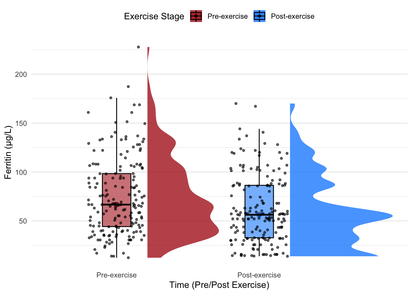
6.3 Combining Violin and Box Plots
To capture both distributional details and statistical summaries, we can combine violin plots and box plots in a single visualization. This hybrid approach offers:
The density insight of violin plots.
The key summary statistics (median, IQR, and outliers) of box plots.
# Combined violin + box plot with data pointsggplot(hbmass_data_clean, aes(x = TIME, y = FER, fill = TIME)) +geom_violin(trim =TRUE, alpha =0.8, width =0.8, color ="black") +# Violin plotgeom_boxplot(width =0.2, alpha =0.6, color ="black", outlier.shape =NA) +# Box plot inside violingeom_jitter(width =0.2, size =1, alpha =0.6, color ="black") +# Add jittered data pointsscale_fill_manual(values =c("#B22222", "#1E90FF")) +# Dark red and dark bluelabs(x ="Time (Pre/Post Exercise)",y ="Ferritin (µg/L)",fill ="Exercise Stage" ) +theme_minimal() +theme(legend.position ="top",panel.grid.major.x =element_blank(),panel.grid.minor.x =element_blank() )
6.4 Key Takeaways
Violin plots allow for a detailed visualization of data distribution, ideal for detecting subtle patterns.
Adding data points provides a bridge between statistical summaries and raw data.
Combining violin and box plots results in a powerful visualization that balances density, distribution, and summary statistics. This hybrid approach is particularly suited for audiences requiring both statistical rigor and interpretive clarity.
Next, we’ll explore raincloud plots, which build on these concepts by incorporating all the strengths of the aforementioned visualizations in a compact form.
7 Raincloud Plots: Merging Individual Data Points with Density Insights
Raincloud plots are a versatile visualization tool that combines the strengths of violin plots, box plots, and scatter plots in a single visualization. They provide an enriched view of the data by presenting individual data points, the distribution density, and key summary statistics all at once. This combination makes raincloud plots particularly effective for showcasing variability, patterns, and outliers within and across groups.
Include raw data points, offering an intuitive understanding of individual variation.
Improve interpretability for audiences less familiar with abstract statistical plots.
7.1 Example: Creating Raincloud Plots
Below, we demonstrate two methods for creating raincloud plots: one using the ggdist package and another using the raincloudplots package. Both approaches offer flexibility in achieving the same visualization, but their implementations differ slightly.
7.1.1 Raincloud Plots with ggdist
The ggdist package provides an intuitive and efficient method for creating raincloud plots. It uses the stat_halfeye() function to generate the half-violin component, which is combined with box plots and jittered data points.
# Load the necessary library for raincloud plotslibrary(ggdist) # For distributional visualization# Create a raincloud plotggplot(hbmass_data_clean, aes(x = TIME, y = FER, fill = TIME)) +# Add half-violin to represent density ggdist::stat_halfeye(adjust =0.6, width =0.8, justification =-0.3, .width =0, alpha =0.8) +# Add box plot for statistical summarygeom_boxplot(width =0.2, alpha =0.6, outlier.shape =NA, color ="black") +# Add jittered data points for individual observationsgeom_jitter(width =0.2, size =1, alpha =0.6, color ="black") +scale_fill_manual(values =c("#B22222", "#1E90FF")) +# Dark red and dark bluelabs(x ="Time (Pre/Post Exercise)",y ="Ferritin (µg/L)",fill ="Exercise Stage" ) +theme_minimal() +theme(legend.position ="top",panel.grid.major.x =element_blank(),panel.grid.minor.x =element_blank() )
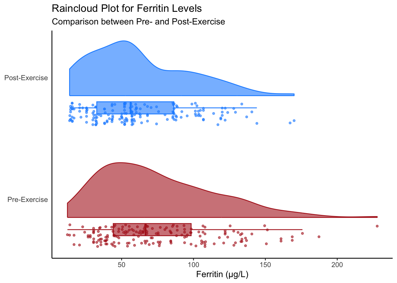
7.1.2 Raincloud Plots with raincloudplots
The raincloudplots package is a specialized tool for creating raincloud plots. It provides dedicated functions for preparing data and visualizing raincloud plots efficiently.
# Load the raincloudplots packagelibrary(raincloudplots)# Prepare data using data_1x1formatted_data <-data_1x1(array_1 = hbmass_data_clean$FER[hbmass_data_clean$TIME =="Pre-exercise"],array_2 = hbmass_data_clean$FER[hbmass_data_clean$TIME =="Post-exercise"],jit_distance =0.09,jit_seed =321)raincloud_1x1(data = formatted_data,colors =c("#B22222", "#1E90FF"),fills =c("#B22222", "#1E90FF"),size =1,alpha =0.6,ort ="h"# Horizontal orientation) +labs(x =NULL,y ="Ferritin (µg/L)",title ="Raincloud Plot for Ferritin Levels",subtitle ="Comparison between Pre- and Post-Exercise" ) +scale_x_continuous(breaks =c(1.5, 2.5), # Position the labels for the groupslabels =c("Pre-Exercise", "Post-Exercise") # Custom group labels ) +theme_classic() +theme(axis.text.y =element_text(size =9), axis.ticks.y =element_blank(), panel.grid =element_blank() )
7.1.3 Comparison of Methods
Both methods achieve similar visualizations but differ in approach:
ggdist: Integrates directly with ggplot2, providing a flexible and customizable framework. The stat_halfeye() function simplifies the creation of the half-violin component and is well-suited for combining with other plot types.
raincloudplots: Designed specifically for raincloud plots, this package streamlines data preparation and plotting, making it ideal for beginners or those seeking a quick, ready-made solution.
8 Conclusion and Reflection
Effective data visualization is critical for understanding data distributions, patterns, and variability. By exploring and applying box plots, violin plots, and raincloud plots, this lesson has equipped you with practical tools to represent data comprehensively and accurately. Moving beyond dynamite plots enables a richer interpretation of data, fostering better decision-making in research and analysis. Reflect on how these techniques can enhance your ability to communicate findings and apply them to future projects.
They show only the mean and standard deviation, hiding the full data distribution.
They require complex computations for summary statistics.
They cannot represent more than two groups.
They are difficult to interpret for large datasets.
They show only the mean and standard deviation, hiding the full data distribution.
Dynamite plots fail to reveal critical details like outliers, data density, and multimodal distributions, which can lead to misleading interpretations.