install.packages(c("tidyverse", "ggrepel", "ggsoccer", "RColorBrewer", "grid", "png", "gridExtra", "cowplot", "forcats"), repos="https://cloud.r-project.org/")Bar Plots
Unraveling Performance Patterns at the FIFA Women’s World Cup 2023: A Dive into the Matildas’ Offensive Metrics and Beyond
Abstract
Numbers offer specificity, but visualizations grant perspective. This lesson underscores the vital role of Exploratory Data Visualizations (EDV) within the broader realm of Exploratory Data Analysis (EDA), using the FIFA Women’s World Cup 2023 data as our canvas. Dive into the versatility of bar plots, one of the key EDV tools, and grasp how they illuminate intricate facets of team and player performance. Tailored for sports and exercise science practitioners, sports analysts, and those eager to harness the power of sports data.
Keywords
Exploratory data analysis (EDA), exploratory data visualization (EDV), bar plot, grouped bar plot, stacked bar plot, ggplot2, football, The Matildas, StatsBomb.
Lesson’s Level
The level of this lesson is categorized as BRONZE.
Lesson’s Main Idea
- Exploratory Data Analysis is about asking the right questions and using the appropriate visuals to glean insights.
- While numbers give us specifics, visualizations offer us perspective. Use visuals as a first step to understand your dataset.
Data used in this lesson is provided by ![]()
1 Learning Outcomes
By the end of this lesson, you will be proficient in:
Extracting and Preprocessing Sports Data: Efficiently pull, load, and refine datasets, like the StatsBomb dataset, ensuring they are tailored for specific analyses.
Understanding the Role of EDV in EDA: Grasping the critical relationship between Exploratory Data Visualizations (EDV) and Exploratory Data Analysis (EDA), and recognizing how visuals serve as the foundation of data exploration.
Constructing Versatile Bar Plots: Crafting intricate bar plot visualizations tailored for sports data, showcasing metrics such as team and player performance and key offensive contributions.
Implementing Advanced
ggplot2Techniques: Applying advanced plotting techniques inggplot2to enhance and customize your visualizations, including annotations, segmentations, and logo integrations.Interpreting Sports Data Visualizations: Developing the acumen to draw actionable insights from visual representations of sports data, aiding in performance analysis and strategic planning.
2 Introduction: Data Exploration in Sport and Exercise Science
2.1 Exploratory Data Analysis
In sport and exercise science (SES), there are numerous ways to generate data. To name a few, vast arrays of data can be generated during games, training sessions, clinical trials and so on. Exploratory Data Analysis (EDA) plays a pivotal role in helping uncover rich insights from data, as well as recognize patterns, anomalies, and the intricate relationships between variables hidden within the data. EDA is fundamental not only for understanding the current state of affairs but also for predicting future trends, optimizing training regimes, improving athletic performance, and much more.
2.2 Exploratory Data Visualizations
In sports, diverse datasets abound, from heart rate dynamics and expired gas analysis in physiology to player performance metrics in football. While numbers give us specifics, visualizations offer perspective. At the heart of EDA lies the power of exploratory data visualizations (EDV). These visual tools simplify complex datasets and make the data speak, allowing us to interpret patterns, outliers, and relationships within the data. By converting raw numbers into meaningful insights with the right visualization, an SES practitioner can immediately discern a standout performer, identify recurring injury patterns, or gauge the effectiveness of a training module. EDV paves the way for data-driven decisions, providing both context and a structured approach to understanding data.
2.3 Distributions - The Starting Point of EDA
The journey of data exploration often commences with understanding its distribution. Whether it is for gauging rehabilitation progress in physiotherapy or analyzing athletic performance metrics, distributions are foundational. Recognizing patterns, such as the frequency of specific heart rates or the prevalence of a particular movement pattern in biomechanics, offers foundational insights into the data’s story. While more comprehensive details on various types of data distributions can be explored in our dedicated lesson, the emphasis of this lesson remains on EDV.
Bridging the understanding of distributions to visualization tools, in this lesson we focus on bar plots. These straightforward visuals efficiently reveal important aspects of data distributions, like centrality and spread, which are especially relevant in sports metrics. As we delve deeper, our aim is to blend essential EDA concepts with hands-on techniques of crafting bar plots. This approach provides SES practitioners with a solid foundation and practical tools for their data exploration journey.
3 Bar Plots
Distributions form the cornerstone of EDA, and bar plots are indispensable tools that bring these distributions to life. By rendering numerical data against categorical variables, bar plots become especially valuable. Whether we are comparing the performance metrics of athletes, understanding the frequencies of physiological responses, or assessing survey results regarding athletes’ mental well-being, bar plots emerge as versatile assets.
3.1 What Are Bar Plots?
A bar plot represents the relationship between a numerical value and a categorical variable. Each category is depicted by a rectangular bar, with its length or height proportional to the value it signifies.
3.2 Types of Bar Plots
Grouped Bar Plot: Perfect for juxtaposing multiple categories side by side, typically to compare different sub-groups. Imagine comparing metrics like goals, shots, and penalties across different football teams in a tournament.
Stacked Bar Plot: Bars are stacked atop each other, summing up the numerical values for each category. This is particularly useful for visualizing compositional data, such as a team’s goal breakdown by right foot, left foot, header, and penalty.
3.3 Strengths of Bar Plots
Bar plots are excellent for:
Showcasing Aggregate Data: Their ability to encapsulate aggregate data ensures an efficient comparison of categories, emphasizing on central tendencies.
Quick Evaluation: In performance analysis, bar plots can expedite understanding player performance or team strategies, answering pivotal questions or shedding light on crucial patterns.
3.4 Making the Most of ggplot2 in Bar Plots
ggplot2 is an integral R-based plotting library that we will utilize throughout this lesson. What makes ggplot2 stand out is its layering principle. Start with a rudimentary plot, then add layers of aesthetics and geometry to enrich both its utility and aesthetics. Each layer embeds more detail or context, crafting the plot progressively. The approach is not only adaptable, but also instinctive.
3.4.1 Functions for Bar Plots in ggplot2
geom_bar: Ideal for creating layered bar charts. By default, it counts cases at each level of a given variable.geom_col: Assumes your data is pre-summarized, takingyvalues to determine bar heights.barplot: A base R function that is less flexible and customizable compared togeom_barandgeom_col.
Note
For more intricate multilayered plots, geom_bar and geom_col are preferable due to their flexibility and compatibility with ggplot2 layers.
Attention to Bar Plots
- Distinguishing from Histograms: Ensure you do not confuse bar plots with histograms; they serve different purposes.
- Orientation: Opt for horizontal bars when dealing with lengthy labels to improve clarity.
- Sorting Bars: Organize your bars in a meaningful order, often by size, for enhanced insights.
4 Case Study - Offensive Metrics at the FIFA Women’s World Cup 2023
Data visualization tools, such as bar plots, play a crucial role in transforming abstract numbers into actionable insights. By using these tools, we can gain a deeper understanding of complex datasets. Drawing from our prior discussion on bar plots, we will now turn our attention to the football data from the FIFA Women’s World Cup 2023. Our goal is to analyze teams’ offensive metrics such as shots and key passes, giving special attention to the performance of the Matildas - the Women’s Australian National Football Team. Through this case study, we aim to showcase the practical application and importance of bar plots in unveiling trends and patterns within sports data.
4.1 What to Expect
Grouped Bar Plot - “Shot Outcome by Distance”: This visualization presents the frequency of shot outcomes relative to the distance from the goal. With central tendency highlighting the most common shot outcome for each distance bin, we can probe: “From which distance do teams shoot most frequently?” The spread, seen through the variety of outcomes, further asks: “Which distances yield higher success rates?” and “Are certain zones more favored for shooting?
Stacked Bar Plot - “Matildas’ Offensive Prowess”: Through this plot, we will peek into individual contributions of the Matildas. The central tendency in this context represents the average shots or key passes per player. This can guide us in determining: “Which players are the most offensive?”, and “Who takes the most shots or delivers key passes?”. Furthermore, the spread, highlighted by the variability of shots/key passes among players, complements the aforementioned insights, offering a deeper understanding of each player’s unique contribution.
Without further ado, let’s delve into the data.
4.2 Data Loading and Cleaning
In this lesson, we will utilize open-access data provided by StatsBomb - one of the world’s leading football analytics companies that provides high-quality football data. We will employ the StatsBombR package in R, which allows efficient access to the StatsBomb data.
To ensure a smooth execution of the code in this lesson, follow the steps below to install the necessary R libraries.
4.2.1 Installing Basic Libraries
Most of the libraries are readily available on CRAN and can be installed using the command install.packages("NameOfPackage"), if they are not already installed on your computer:
4.2.2 Installing From GitHub
Some packages, such as StatsBombR, are not available on CRAN and need to be installed from GitHub. This can be achieved using the devtools package. If you have not already, please install devtools:
install.packages("devtools", repos="https://cloud.r-project.org/")In order to install packages from GitHub, ensure Git is also set up on your machine1. If it is not installed, download and install Git. This will allow devtools to clone and install packages from GitHub directly.
Now, the StatsBombR package can be installed using the following command:
devtools::install_github("statsbomb/StatsBombR")After you have installed all the required packages, you can load them into your current R session as follows:
rm(list = ls()) # clean the workspace

# Load required libraries
library(StatsBombR)    # For accessing and handling StatsBomb football data
library(tidyverse)     # For data manipulation and visualization
library(ggrepel)       # To avoid label overlap in plots
library(ggsoccer)      # For plotting soccer pitches
library(RColorBrewer)  # For colorblind-friendly palettes
library(grid)          # For lower-level graphics functions
library(png)           # To read and write PNG images
library(gridExtra)     # For arranging multiple grid-based plots
library(cowplot)       # For enhancing and customizing ggplot figures
library(forcats)       # For categorical variable (factor) manipulation
4.2.3 Pulling and Organizing StatsBomb Data
Explore the Code
This lesson features annotated code sections, with comments elucidating the intent and operation of every code snippet. Nonetheless, to genuinely grasp the influence of a particular plot customization function, it is advisable to momentarily comment out that specific code line and see the consequent modifications in the graphic. For RStudio users on macOS, the keyboard shortcut to comment out a line or multiple lines of code is .
The initial step involves retrieving and loading the StatsBomb dataset, followed by the extraction of relevant data for this lesson. The code provided below accomplishes this task.
# ---- Load and Tidy Up StatsBomb data ----

#* Pull and load free StatsBomb data ----

# Measure the time it takes to execute the code within the system.time brackets (for performance)
system.time({
  # Fetch list of all available competitions
  all_comps <- FreeCompetitions()

  # Filter to get only the 2023 FIFA Women's World Cup data (Competition ID 72, Season ID 107)
  Comp <- all_comps %>%
    filter(competition_id == 72 & season_id == 107)

  # Fetch all matches of the selected competition
  Matches <- FreeMatches(Comp)

  # Download all match events and parallelize to speed up the process
  StatsBombData <- free_allevents(MatchesDF = Matches, Parallel = T)

  # Clean the data
  StatsBombData = allclean(StatsBombData)
})

# Show the column names of the final StatsBombData dataframe
names(StatsBombData)
After loading the data and briefly examining it to acquaint ourselves with the structure of the StatsBombData dataframe, we can proceed to refine the team names.
#* Tidy up the teams' names ----

# Create a dataframe containing unique names of all teams at FWWC23
WWC_teams <- data.frame(team_name = unique(StatsBombData$team.name))

# Remove the " Women's" part from team names for simplicity
StatsBombData$team.name <- gsub(" Women's", "", StatsBombData$team.name)

# Rename and simplify team names in the 'Matches' dataframe
Matches <- Matches %>%
  rename(
    home_team = home_team.home_team_name,
    away_team = away_team.away_team_name
  ) %>%
  mutate(
    home_team = gsub(" Women's", "", home_team),
    away_team = gsub(" Women's", "", away_team)
  )
With preparations complete, we can now delve into data analysis and craft bar plot visualizations for our target metrics. We will commence with a grouped bar plot.
4.3 Grouped bar plot
4.3.1 Data Filtering
The code below filters out unnecessary columns from the StatsBombData dataframe and focuses only on shots that are not penalties. Additionally, it consolidates shot outcomes into distinct categories: Goal, Off T (Off Target), Saved, Saved to Post, and Post.
# ---- Grouped Bar Plot ----
### Shot Outcome by Distance

#* Filter the data ----

# Select only relevant columns and filter the dataset to include only shots that are not penalties
shot_outcomes <- StatsBombData%>%
  select(player.name, team.name, type.name, shot.type.name, shot.outcome.name, DistToGoal)%>%
  filter(type.name == "Shot" & (shot.type.name != "Penalty"|is.na(shot.type.name)))%>%
  filter(shot.outcome.name %in% c("Goal", "Off T", "Saved", "Saved to Post", "Post"))
4.3.2 Consolidating Shot Outcomes
Specific similar shot outcomes are amalgamated into more general categories to simplify data interpretation. For instance, “Saved to Post” is reclassified as “Saved”.
# Consolidate similar shot outcomes into broader categories
shot_outcomes <- shot_outcomes %>%
  mutate(shot.outcome.name = case_when(
    shot.outcome.name == "Saved to Post" ~ "Saved",
    shot.outcome.name == "Post" ~ "Off T",
    TRUE ~ shot.outcome.name
  ))
4.3.3 Binning the ‘Shot Distance To Goal’
The code divides the distance to goal (DistToGoal) into bins. It initially determines the minimum and maximum distances for all shots and then creates bins in 10-meter intervals.
# Calculate min and max distance to goal
min_dist <- min(shot_outcomes$DistToGoal, na.rm = TRUE)
max_dist <- max(shot_outcomes$DistToGoal, na.rm = TRUE)

# Display min and max distances
cat("Minimal distance of a shot to goal is: ", min_dist, "\n")
Minimal distance of a shot to goal is: 1.860108 cat("Maximal distance of a shot to goal is: ", max_dist, "\n")Maximal distance of a shot to goal is: 55.34781 # Create bins for DistToGoal
bin_size = 10
shot_outcomes <- shot_outcomes%>%
mutate(DistToGoal_Binned = cut(DistToGoal, breaks = seq(0, max(DistToGoal) + 10, by = 10)))4.3.4 Creating the Grouped Bar Plot
The code employs ggplot to generate a bar plot with the x-axis denoting binned distances to goal and the y-axis indicating shot counts. Bars are distinguished by color according to the shot outcomes.
Tip
You can view all available colour palettes by calling display.brewer.all() from the RColorBrewer package.
# Create the bar plot
shot_dist_viz <- ggplot(shot_outcomes) +
  geom_bar(aes(x = DistToGoal_Binned, fill = shot.outcome.name), width = 0.7, position = "dodge",
           color = "black", size = 0.5) +
  scale_y_continuous(
    limits = c(0, 210),
    breaks = seq(0, 210, by = 50),
    expand = expansion(mult = c(0, 0.05)),
    position = "left"
  ) +
  scale_x_discrete(expand = expansion(add = c(0, 0)), labels = function(x) gsub("\\((.*),(.*)\\]", "\\1 - \\2", x)) +
  theme(
    # Set background color to white
    panel.background = element_rect(fill = "white"),
    # Set the color and the width of the grid lines
    panel.grid.major.y = element_line(color = "#A8BAC480", size = 0.3),
    # Remove tick marks by setting their length to 0
    axis.ticks.length = unit(0, "mm"),
    # Customize the title for both axes
    axis.title = element_text(family = "sans", size = 16, color = "black", face = "bold"),
    # Only bottom line is painted in black
    axis.line.x.bottom = element_line(color = "black"),
    # Remove labels from the horizontal axis
    axis.text.x = element_text(family = "sans", size = 16, color = "black"),
    # Customize labels for the vertical axis
    axis.text.y = element_text(family = "sans", size = 16, color = "black"),
    legend.title = element_blank(),
    legend.text = element_text(family = "sans", size = 16, color = "black"),
    legend.position = c(0.9, 0.85)
  ) +
  labs(title = "Shot Outcome by Distance",
       subtitle = "Counts of non-penalty shot outcomes binned by distance at FIFA Women's World Cup 2023",
       x = "Distance to Goal [m]",
       y = "Count of Shots") +
  theme(
    plot.title = element_text(
      family = "sans",
      face = "bold",
      size = 16,
      color = "black"
    ),
    plot.subtitle = element_text(
      family = "sans",
      size = 16,
      color = "black"
    )
  ) +
  scale_fill_manual(values=c("#DC2228", "#3371AC", "gold"), labels = c("Goal","Off Target","Saved"))
4.3.5 Adding Count Labels
Upon grouping the data by distance bins and shot outcomes, the code appends each bar with the corresponding count of shot occurrences.
# Calculate the count of each shot outcome for each distance bin
shot_outcomes_sum <- shot_outcomes %>%
  group_by(DistToGoal_Binned, shot.outcome.name) %>%
  summarise(count = n(), .groups = 'drop')

# Add count labels to the bars
shot_dist_viz <- shot_dist_viz +
  geom_text(data = shot_outcomes_sum,
          aes(x = DistToGoal_Binned, y = count, label = count, group = shot.outcome.name),
          vjust = -0.5,
          position = position_dodge(width = 0.7),
          size = 5.5,
          color = "black")
Note
Using .groups = 'drop' effectively ungroups the data, making the dataframe easier to manage and the code more explicit.
4.3.6 Adding the StatsBomb Logo
The StatsBomb logo is inserted into the bottom right corner of the plot.
Warning
To ensure the code below runs smoothly, download the required StatsBomb logo from here and save it in the same directory as your R script file. In the script, you can then use a relative path to load the image (e.g., ‘img_path’ for a filename like ‘SB_logo.png’). Remember, for the relative path to work, the working directory should be set to where the script is. In R, use getwd() to check the current directory and setwd("/path/to/directory") to set it.
# Specify the path to the StatsBomb logo
img_path <- "SB_logo.png"

# Add the StatsBomb logo to the plot
shot_dist_viz_sb <- ggdraw(shot_dist_viz) +
  draw_image(img_path, x = 0.87, y = 0, width = 0.12, height = 0.06)

shot_dist_viz_sb <- ggdraw(shot_dist_viz_sb) +
  draw_label("Data:", x = 0.84, y = 0.03, size = 16)

# Show the finalized plot with the StatsBomb logo
print(shot_dist_viz_sb)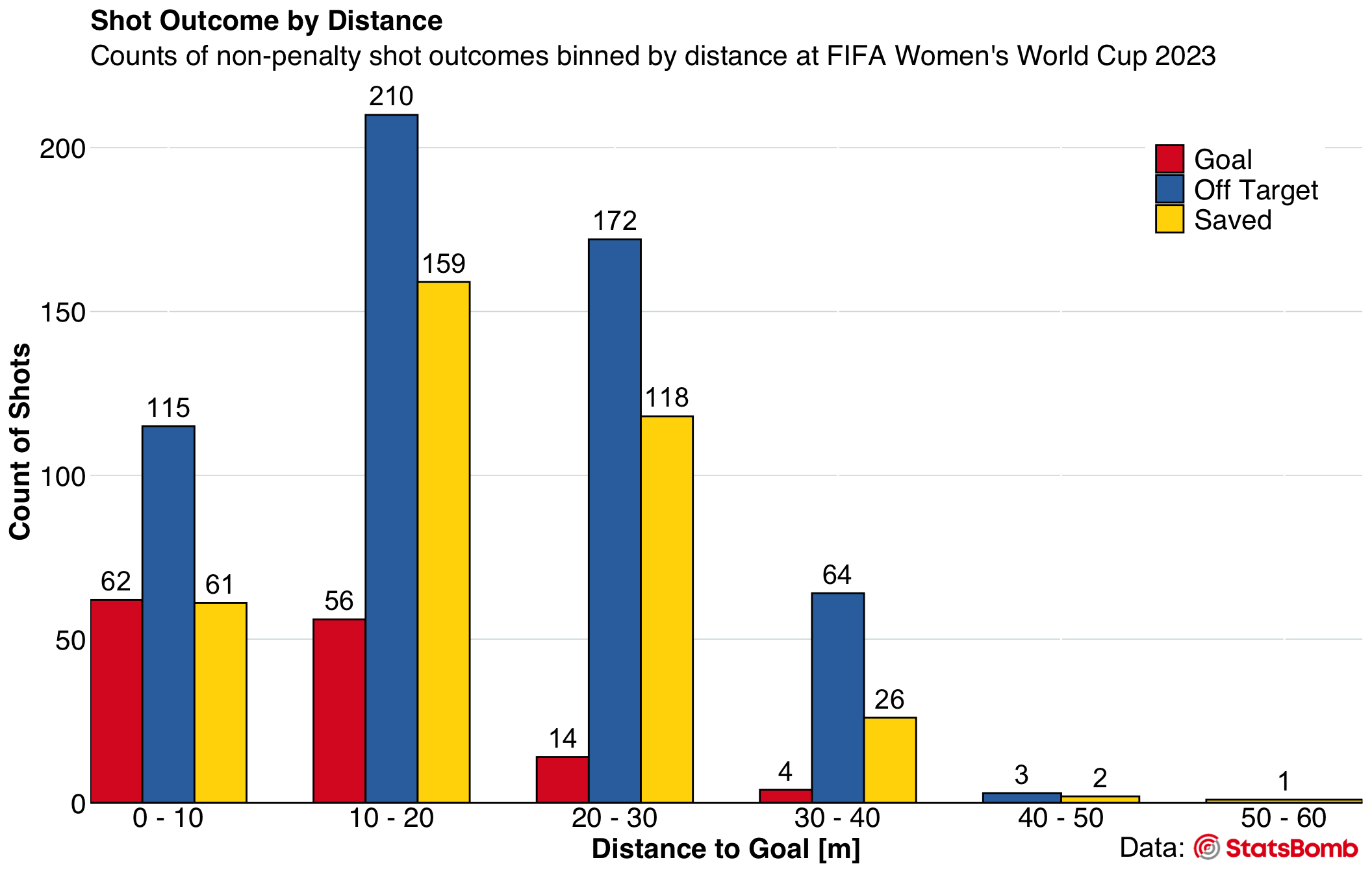
The finalized plot is saved as a PNG file.
# ggsave("Shot_Outcome_by_Distance.png", plot = shot_dist_viz_sb, width = 10, height = 8, dpi = 300)4.4 Stacked Bar Plot
In this section, we generate a horizontal stacked bar plot that illustrates the offensive contributions of the Matildas’ players during the FIFA Women’s World Cup 2023. The visualization highlights two primary metrics for each player: shots per 90 minutes (shots_p90) and key passes per 90 minutes (key_passes_p90). Combined, these metrics convey the total “value added in attack” per 90 minutes for every player.
On the plot, each horizontal bar signifies a player. This bar is divided into two segments: one representing ‘shots_p90’ and the other ‘key_passes_p90’. The extent of each segment mirrors the player’s contributions in the said categories. Numeric labels within these segments further specify the count of shots or key passes per 90 minutes attributed to the respective player.
4.4.1 Data Filtering
Filter the StatsBomb data to include only shots and passes performed by the Matildas players. For shots, we are interested in non-penalty attempts with specific outcomes, including goals, shots that were saved, off-target shots, and shots hitting the post. For passes, our focus is on those that led directly to a shot or resulted in a goal. In our analysis, we choose to create two separate dataframes for shots and passes, processing them individually before merging them later. This method aligns with the data analysis paradigm of ‘split-apply-combine’.
# Select relevant columns and filter the StatsBomb data to only include non-penalty shots taken by the Matildas players. Also, select only the particular types of shots we are interested in.
shots_Matildas <- StatsBombData%>%
  select(player.name, player.id, team.name, team.id, type.name, shot.type.name, shot.outcome.name, shot.statsbomb_xg, location.x, location.y, DistToGoal)%>%
  filter(team.name == "Australia")%>%
  filter(type.name == "Shot" & (shot.type.name != "Penalty"|is.na(shot.type.name)))%>%
  filter(shot.outcome.name %in% c("Goal", "Off T", "Saved", "Saved to Post", "Post"))

# Select relevant columns and filter the StatsBomb data to only include passes by the Matildas players that resulted in a shot or a goal.
passes_Matildas <- StatsBombData%>%
  select(player.name, player.id, team.name, team.id, type.name, pass.shot_assist, pass.goal_assist)%>%
  filter(team.name == "Australia")%>%
  filter(pass.shot_assist==TRUE | pass.goal_assist==TRUE)
4.4.2 Extracting Players’ Last Names
Incorporate a new column that captures players’ last names, derived using the extract_last_name function provided below. This function also accounts for names incorporating “van”. Subsequently, adjust the column sequence to position ‘last_name’ immediately after ‘player.name’.
# Function to extract the last name from a full name string
extract_last_name <- function(full_name) {
  name_parts <- strsplit(full_name, " ")[[1]]

  # Check if the name contains "van"
  if ("van" %in% name_parts) {
    # Concatenate "van" with the last name
    return(paste("van", tail(name_parts, 1), collapse = " "))
  } else {
    # Just return the last name
    return(tail(name_parts, 1))
  }
}

# Add a new column for players' last names
shots_Matildas$last_name <- sapply(shots_Matildas$player.name, extract_last_name)

# Reorder the columns to have last_name appear after player.name
shots_Matildas <- shots_Matildas %>%
  select(player.name, last_name, everything())

# Create a new column for players' last names
passes_Matildas$last_name <- sapply(passes_Matildas$player.name, extract_last_name)

# Reorder the columns to have last_name appear after player.name
passes_Matildas <- passes_Matildas %>%
  select(player.name, last_name, everything())
4.4.3 Computing Metrics and Normalizing Them to 90 Minutes
First, we organize our data based on individual players, tallying the number of non-penalty shots each player has taken. Using the total minutes each player has been on the pitch, we then normalize these shot metrics to 90 minutes of play, a common normalization factor in football analysis.
Moving on, we calculate the cumulative number of key passes (passes made in the final third of the football pitch leading to a shot on goal or an actual goal) for each player, again normalized to 90 minutes. With these metrics in hand, we introduce the ‘value_added_attack_p90’ statistic, representing the total offensive contribution of each player per 90 minutes.
In essence, this series of calculations provides a robust, normalized metric that encapsulates a player’s offensive potency.
# Calculate stats for each player
# Group by player and count the number of shots they have taken
shots_Matildas_stats <- shots_Matildas%>%
  group_by(player.name, player.id, last_name)%>%
  summarise(shots=sum(type.name=="Shot", na.rm=TRUE),
            .groups = "drop")

#* Normalize all metrics to 90 minutes ----

# Get the total minutes played by all players
all_players_minutes = get.minutesplayed(StatsBombData)

# Extract Australia's team ID
Australia_team_id <- unique(shots_Matildas$team.id)

# Sum up the total minutes played by each Matilda
Matildas_minutes <- all_players_minutes %>%
  filter(team.id == Australia_team_id) %>%
  group_by(player.id) %>%  # Group data by player.id
  summarise(total_minutes_played = round(sum(MinutesPlayed), digits = 2), # Sum up the total minutes played
            .groups = "drop")

# Join the minutes data to the shot stats data
shots_Matildas_stats <- shots_Matildas_stats%>%
  left_join(Matildas_minutes, by = "player.id")

# Calculate per 90-minute metrics for shots
shots_Matildas_stats <- shots_Matildas_stats%>%
  mutate(nineties = round(total_minutes_played/90, digits=2))

shots_Matildas_stats <- shots_Matildas_stats%>%
  mutate(shots_p90 = shots/nineties)

# Group by player and calculate total key passes (shot assists + goal assists)
key_passes_Matildas <- passes_Matildas %>%
  group_by(player.id, player.name, last_name) %>%
  summarise(total_key_passes = sum(pass.shot_assist, na.rm = TRUE) + sum(pass.goal_assist, na.rm = TRUE))

# Merge key_passes_Matildas data with shots_Matildas_stats data - we need this step here to get access to the 'nineties' column in the 'shots_Matildas_stats' dataframe
complete_stats_Matildas <- full_join(shots_Matildas_stats, key_passes_Matildas, by = "player.id")

# Calculate key passes per 90 minutes
complete_stats_Matildas <- complete_stats_Matildas %>%
  mutate(key_passes_p90 = total_key_passes / nineties)

# Calculate value added in attack per 90 minutes
complete_stats_Matildas <- complete_stats_Matildas %>%
  mutate(value_added_attack_p90 = shots_p90 + key_passes_p90)

# Handle any NAs by setting them to zero
complete_stats_Matildas <- complete_stats_Matildas %>%
  mutate(
    shots_p90 = coalesce(shots_p90, 0),  # Replace NA with 0 if any
    key_passes_p90 = coalesce(key_passes_p90, 0),  # Replace NA with 0 if any
    value_added_attack_p90 = shots_p90 + key_passes_p90  # Now this should work correctly
  )
4.4.4 Converting Data to Long Format
Within the framework of ggplot2, transforming data to the long format involves restructuring the dataset such that variables and their values form two columns: one representing the variable names and the other their associated values. Adopting this format proves advantageous for crafting intricate visualizations, as it facilitates the effortless mapping of variables to aesthetic features in ggplot2, be it color, shape, or size.
# Convert data to long format for plotting ----
chart_data <- complete_stats_Matildas %>%
  ungroup() %>%
  select(last_name.x, shots_p90, key_passes_p90, value_added_attack_p90) %>%
  arrange(desc(value_added_attack_p90)) %>% # Sorting players by value_added_attack_p90
  pivot_longer(c(shots_p90, key_passes_p90), names_to = "variable", values_to = "value")
4.4.5 Creating the Stacked Bar Plot
# Create the ggplot object
attack_viz <- ggplot(chart_data, aes(x = reorder(last_name.x, value), y = value, fill=fct_rev(variable))) +
  geom_bar(stat="identity", position = "stack", color = "black", size = 0.5) +
  geom_text(aes(label = ifelse(value > 0, round(value, 2), "")), colour = "black", size = 4, hjust = 0.35, position = position_stack(vjust = 0.61)) + # Labels inside bars
  coord_flip() +
  scale_y_continuous(position = "right",
                     limits = c(0,6.3),
                     breaks = seq(0, 6, by = 1),
                     expand = c(0,0)) +
  scale_x_discrete(expand = c(0, 0.7)) +
  theme(
    # Set background color to white
    panel.background = element_rect(fill = "white"),
    # Set the color and the width of the grid lines
    panel.grid.major.x = element_line(color = "#A8BAC480", size = 0.3),
    # Remove tick marks by setting their length to 0
    axis.ticks.length = unit(0, "mm"),
    # Customize the title for both axes
    axis.title = element_blank(),
    # Only left line of the vertical axis is painted in black
    axis.line.y.left = element_line(color = "black"),
    # Customize labels
    axis.text.y = element_text(family = "sans", size = 16, color = "black"),
    axis.text.x = element_text(family = "sans", size = 16, color = "black"),
    # Customize legend
    legend.title = element_blank(),
    legend.text = element_text(family = "sans", size = 16, color = "black"),
    legend.position = c(0.8, 0.5)
  ) +
  scale_fill_manual(
    values = c("shots_p90" = "#f1c40f", "key_passes_p90" = "#1abc9c"),
    labels = c("Shots P90", "Key Passes P90")
  ) +
  labs(title = "Matildas' Offensive Prowess",
         subtitle = "Shots Per 90 and Key Passes Per 90 at FIFA Women's World Cup 2023") +
  theme(
    plot.title = element_text(
      family = "sans",
      face = "bold",
      size = 16,
      color = "black"
    ),
    plot.subtitle = element_text(
      family = "sans",
      size = 16,
      color = "black"
    )
  )
4.4.6 Adding the StatsBomb Logo
Insert the StatsBomb logo and save the plot.
Warning
To ensure the code below runs smoothly, download the required StatsBomb logo from here and save it in the same directory as your R script file. In the script, you can then use a relative path to load the image (e.g., ‘img_path’ for a filename like ‘SB_logo.png’). Remember, for the relative path to work, the working directory should be set to where the script is. In R, use getwd() to check the current directory and setwd("/path/to/directory") to set it.
# Insert the Statsbomb logo ----
img_path <- "SB_logo.png"

attack_viz_sb <- ggdraw(attack_viz) +
  draw_image(img_path, x = 0.8, y = 0, width = 0.13, height = 0.065)

attack_viz_sb <- ggdraw(attack_viz_sb) +
  draw_label("Data:", x = 0.77, y = 0.033, size = 16)

# Show the final plot
print(attack_viz_sb)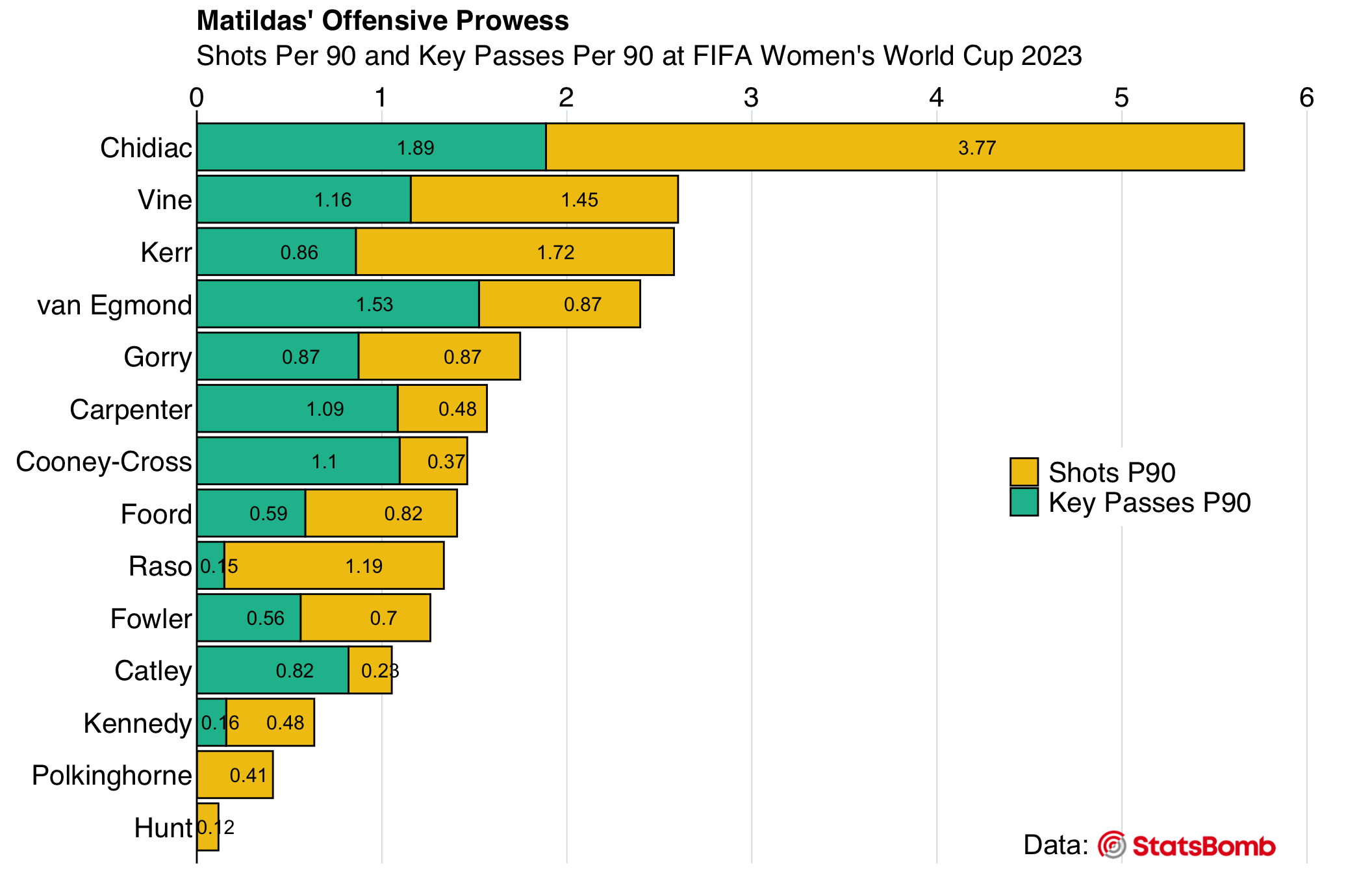
#* Save the visualization to png ----

# ggsave("Matildas_Offensive_Prowess.png", plot = attack_viz_sb, width = 10, height = 8, dpi = 300)
Challenge for the Learner
Deepen your grasp of bar plots and the FIFA Women’s World Cup 2023 data by:
- Creating a grouped bar plot specifically for the Matildas players.
- Generating a stacked bar plot that includes players from all teams, but only those who played more than 2 “nineties”.
5 Conclusion and Reflection
Sports data, be it performance metrics or physiological readings, share universal principles. The application of Exploratory Data Analysis (EDA) is the foundational step when working with data of any type and origin. Exploratory Data Visualizations (EDV) serve as a backbone of EDA, regardless of the specific sport or exercise science discipline. Visualizing data, whether in performance analysis or physiology, follows consistent principles — it is all about asking pertinent questions and using suitable visuals for answers. As demonstrated with the football data from the FIFA Women’s World Cup 2023 in this lesson, visual tools like bar plots are versatile. Applied to sports data, they can illustrate player performance as effectively as they depict average heart rates across different exercise regimes. Understanding such aggregates, whether it is discerning the frequency of key passes or assessing average heart rates, lays the groundwork for subsequent analyses and modeling.
The journey of EDA is sequential: after recognizing patterns and distributions, the focus shifts to deciphering relationships between variables and underlying patterns. This progression underpins the broader scope of EDA — commencing with understanding distributions and culminating in predicting outcomes, enhancing strategies, and fortifying performance. To learn about more EDA and EDV tools, please explore further lessons on our portal.
6 Knowledge Spot-Check
Why is exploratory data visualization crucial for data analysis?
A) It makes data colorful.
B) It offers an easy way to detect errors in data.
C) It simplifies complex statistical measures into understandable visuals.
D) It’s an alternative to traditional statistics.
Expand the see the correct answer.
A) It makes data colorful.
B) It offers an easy way to detect errors in data.
C) It simplifies complex statistical measures into understandable visuals.
D) It’s an alternative to traditional statistics.
Expand the see the correct answer.
The correct answer is C) It simplifies complex statistical measures into understandable visuals.
How can bar plots provide insights into your data?
A) They represent the frequency of categorical data.
B) They show the relationship between two numerical variables.
C) They visualize time series data trends.
D) They highlight the hierarchical structure of data.
Expand the see the correct answer.
A) They represent the frequency of categorical data.
B) They show the relationship between two numerical variables.
C) They visualize time series data trends.
D) They highlight the hierarchical structure of data.
Expand the see the correct answer.
The correct answer is A) They represent the frequency of categorical data.
In the context of the lesson, what purpose do bar plots serve?
A) Display relationships between two continuous variables.
B) Display the distribution of a single categorical variable.
C) Compare the values of different groups.
D) Showcase time series data.
Expand the see the correct answer.
A) Display relationships between two continuous variables.
B) Display the distribution of a single categorical variable.
C) Compare the values of different groups.
D) Showcase time series data.
Expand the see the correct answer.
The correct answer is C) Compare the values of different groups.
What data format is the most suitable for a stacked bar plot visualization?
A) A wide format with columns representing categories.
B) A long format where one column specifies the categories and another column provides the values.
C) Data with only numerical variables.
D) Data with only one categorical variable.
Expand the see the correct answer.
A) A wide format with columns representing categories.
B) A long format where one column specifies the categories and another column provides the values.
C) Data with only numerical variables.
D) Data with only one categorical variable.
Expand the see the correct answer.
The correct answer is B) A long format where one column specifies the categories and another column provides the values.
How do you implement customization of ggplot objects?
A) By directly editing the original data.
B) By using the theme() function and other scale functions.
C) By using external software to modify the visualization after export.
D) By using the coord_flip() function.
Expand the see the correct answer.
A) By directly editing the original data.
B) By using the theme() function and other scale functions.
C) By using external software to modify the visualization after export.
D) By using the coord_flip() function.
Expand the see the correct answer.
The correct answer is B) By using the theme() function and other scale functions.
Footnotes
The easiest way to check if Git is installed on your computer is by using the terminal (on macOS or Linux) or the command prompt (on Windows).
macOS and Linux:
- Open the Terminal.
- Type
git --versionand press Return. - If you see a version number, it means Git is installed. If you see a message like “command not found,” then Git is not installed.
Windows:
- Open the Command Prompt.
- Type
git --versionand press Enter. - If you see a version number, it means Git is installed. If you see a message like ” ‘git’ is not recognized as an internal or external command”, then Git is not installed.