Exploratory Data Analysis (EDA) in Sport and Exercise Science
Unveiling Patterns and Relationships in Athlete Data
Abstract
Explore the fundamentals of exploratory data analysis (EDA) in the domain of sports science. This practical lesson introduces EDA using R and the speedsR package, focusing on real-world applications in the analysis of athlete data. Gain essential skills in visualizing and interpreting data distributions, correlations, and interactions between variables. Perfect for sports scientists and data analysts, this lesson emphasizes practicality, equipping you with the tools needed to draw meaningful insights from data and apply them effectively in training and performance contexts.
The level of this lesson is categorized as BRONZE.
Lesson’s Main Idea
Exploratory Data Analysis (EDA) serves as the foundational step in sport science analytics, enabling the uncovering of underlying data structures and key characteristics without preconceived hypotheses.
By mastering EDA techniques in R, practitioners can effectively visualize, analyze, and interpret their data, discovering unexpected patterns and crucial insights that drive evidence-based strategies in sport and exercise science.
1 Learning Outcomes
By the end of this lesson, you will have developed the ability to:
Conduct Univariate and Multivariate Analysis: Perform univariate analysis to understand single-variable distributions and multivariate analysis to explore relationships between multiple variables, applying these insights to sport science data.
Utilize Graphical and Statistical EDA Techniques: Master the use of graphical methods such as histograms, box plots, and scatter plots, as well as statistical techniques including correlation and regression analysis to uncover patterns and associations within the data.
Interpret Distribution Characteristics: Analyze and interpret key statistical metrics such as skewness and kurtosis to understand the nature of data distributions and identify potential outliers or anomalies.
Apply EDA in R: Leverage R programming and its powerful libraries to execute exploratory data analysis, enhancing your analytical skills and improving your decision-making in sport and exercise science contexts.
2 Introduction to Exploratory Data Analysis (EDA) in Sport and Exercise Science
2.1 What is Exploratory Data Analysis?
Exploratory Data Analysis, commonly known as EDA, is a fundamental process in data science aimed at uncovering the underlying structure of data and its key characteristics. In the context of sport and exercise science, EDA is an invaluable tool that helps practitioners analyze performance metrics, assess athlete health data, and understand trends in sports injuries or training outcomes. By applying EDA, sports scientists can explore data without preconceived hypotheses, enabling them to discover unexpected patterns, identify anomalies, and test assumptions.
2.2 Why EDA Matters in Sports Science
In sports analytics, EDA is essential for validating data quality, ensuring accurate analysis, and deriving insights that can influence training programs and game strategies. It allows for the examination of variables and relationships within the data, helping practitioners make informed decisions based on statistical evidence. EDA techniques facilitate a deeper understanding of the data, such as discovering relationships between player performance metrics and outcomes, or evaluating the effectiveness of training regimens.
2.3 Techniques and Tools for EDA
EDA can be broadly classified into several types, each offering different insights:
Univariate Analysis:
Graphical methods: Histograms, box plots, and stem-and-leaf plots provide a visual summary of single variables, highlighting the distribution, central tendency, and dispersion.
Non-graphical methods: These involve summary statistics like mean, median, and mode, which help describe the basic features of the data.
Bivariate and Multivariate Analysis:
Graphical methods: Scatter plots, grouped bar plots, and heat maps show the relationship between two or more variables. These are crucial for identifying correlations or interactions between different data aspects, such as the impact of different training loads on athlete performance.
Non-graphical methods: Techniques such as cross-tabulation and correlation coefficients help quantify the strength and direction of relationships between variables.
2.4 EDA as a Cyclical Process
EDA is not a one-time task but a cyclical process that evolves with the analysis. As new data comes in or as further analysis is conducted, sports scientists may return to EDA to refine their models or to explore new hypotheses. This iterative nature ensures that the insights remain relevant and that the models continually improve, aligning with the dynamic and evolving field of sports science.
For practitioners in sport and exercise science, mastering EDA is crucial for making the most of their data. Whether it’s improving team performance, optimizing athlete health, or predicting future trends, EDA provides a robust foundation for any further analysis or modeling. Through the practical application of EDA techniques, sports scientists can ensure that their conclusions and recommendations are well-supported by data.
In this lesson, we will explore simple, real-world examples of how these EDA techniques can be applied using R programming language to sports data, providing a hands-on understanding of each method’s utility and impact.
3 Loading and Exploring the HbmassSynth Dataset
In our EDA lesson, we will explore the HbmassSynth dataset from the speedsR package, an R data package specifically designed for the SPEEDS project. This package provides a collection of sports-specific datasets, streamlining access for analysis and research in the sports science context. The HbmassSynth dataset offers valuable insights into the effects of moderate altitude exposure and iron supplementation on hematological variables in endurance athletes. Before we dive into exploratory data analysis, let’s first load and familiarize ourselves with this dataset. For more information about the speedsR package and its offerings, please visit the dedicated page on our platform here.
3.1 Understanding the Dataset
The HbmassSynth dataset represents a synthetic study aimed at investigating how oral iron supplementation affects hemoglobin mass (Hbmass) and iron parameters after 2–4 weeks of moderate altitude exposure. Understanding these relationships is crucial for optimizing athlete performance and health.
3.2 Loading the Dataset
First, we’ll load the dataset into our R environment. We will use the speedsR package, which contains the dataset in a tibble format. Tibbles are enhanced versions of R dataframes provided by the tidyverse, making them more user-friendly for data manipulation.
Here is how to load and initially explore the HbmassSynth dataset:
# Load the speedsR packagelibrary(speedsR)# Access and assign the dataset to a variablehbmass_data <- HbmassSynth# View the first few rows of the dataset to understand its structurehead(hbmass_data)
This code snippet loads the HbmassSynth dataset and displays its first few rows, providing a preview of the data’s structure and the types of variables it contains.
3.3 Overview of Variables
The dataset contains several key variables, each representing different hematological measures and participant characteristics:
ID: Participant identifier, a unique integer for each athlete.
TIME: Categorical factor indicating the timing of the measurement (0 = Pre-exposure, 1 = Post-exposure).
SUP_DOSE: Categorical factor representing the dose of oral iron supplement in milligrams (0 = None, 1 = 105 mg, 2 = 210 mg).
BM: Body mass in kilograms.
FER: Ferritin level in micrograms per litre, indicating iron storage.
FE: Iron level in micrograms per litre.
TSAT: Transferrin Saturation percentage, a measure of iron availability.
TRANS: Transferrin in grams per litre, related to iron transport.
AHBM: Absolute Hemoglobin Mass in grams, the primary variable of interest.
RHBM: Relative Hemoglobin Mass, computed as AHBM divided by body mass (g/kg).
3.4 Story Behind the Data
The purpose of collecting this data was to assess the impact of altitude training combined with iron supplementation on key hematological markers. This type of analysis is critical for sports scientists and coaches to understand how to enhance athletic performance and manage athlete health effectively under different training conditions.
The dataset’s richness allows for multiple avenues of exploration, from assessing the basic impacts of altitude and supplementation on athlete health to more nuanced analyses of how these factors interact with sex and body mass. Each variable provides a specific lens through which to view the athlete’s physiological responses, offering insights that can guide training and recovery strategies.
In the following sections, we will delve deeper into this dataset using various exploratory data analysis techniques to uncover patterns and trends in the data.
3.5 Separating Pre and Post-Exposure Data
In the HbmassSynth dataset, the TIME variable categorizes data into two groups representing measurements taken before (TIME = 0) and after (TIME = 1) the athletes’ exposure to moderate altitude. This differentiation allows us to analyze how hematological variables change due to the intervention.
To effectively analyze these changes, we’ll first separate the dataset into two parts based on the TIME variable. This will enable us to handle and analyze pre-exposure and post-exposure data independently, providing clearer insights into the effects of altitude exposure on the athletes.
Here’s how we can separate the dataset and assign each subset to a descriptive variable:
# Separate the data into pre-exposure and post-exposure datasetspre_exposure_data <- hbmass_data[hbmass_data$TIME ==0, ]post_exposure_data <- hbmass_data[hbmass_data$TIME ==1, ]# View the structure of the separated datasetshead(pre_exposure_data)
For simplicity and conciseness of this lesson, we will primarily focus on the pre-exposure data. This approach allows us to establish a baseline understanding of the hematological variables before any altitude intervention. However, later in the lesson, we will compare key parameters between the pre-exposure and post-exposure datasets.
By separating the dataset in this way, we can maintain a clear and structured approach to our exploratory data analysis, ensuring that our findings are both comprehensive and easy to understand.
4 Univariate Analysis
4.1 Descriptive and Summary Statistics
In this section of this EDA lesson, we will focus on univariate analysis of the pre-exposure data from the HbmassSynth dataset. Univariate analysis allows us to understand the distribution, central tendency, and variability of individual variables independently. We will start with non-graphical methods to get a thorough understanding of each variable’s characteristics.
4.1.1 Descriptive Statistics with R Functions
One common method to obtain descriptive statistics in R is by using the summary() function, which provides a quick overview of the minimum, maximum, median, mean, and the 1st and 3rd quartiles of numeric data. This function can help identify potential outliers and give a concise snapshot of data distribution.
# Summary statistics of the pre-exposure datasummary(pre_exposure_data)
       ID           TIME       SEX     SUP_DOSE         BM
 Min.   :  1.00   0   :178   0   :80   0   : 15   Min.   :47.00
 1st Qu.: 45.25   1   :  0   1   :98   1   :144   1st Qu.:59.23
 Median : 89.50   NA's:  1   NA's: 1   2   : 19   Median :65.55
 Mean   : 89.50                        NA's:  1   Mean   :66.51
 3rd Qu.:133.75                                   3rd Qu.:72.90
 Max.   :178.00                                   Max.   :97.40
 NA's   :1                                        NA's   :1
      FER               FE             TSAT           TRANS
 Min.   : 12.30   Min.   : 6.10   Min.   : 3.10   Min.   :1.300
 1st Qu.: 44.17   1st Qu.:14.47   1st Qu.:20.00   1st Qu.:2.500
 Median : 66.65   Median :17.05   Median :26.00   Median :2.800
 Mean   : 75.06   Mean   :19.41   Mean   :28.64   Mean   :2.777
 3rd Qu.: 98.38   3rd Qu.:24.14   3rd Qu.:35.00   3rd Qu.:3.100
 Max.   :227.80   Max.   :40.50   Max.   :88.00   Max.   :4.100
 NA's   :1        NA's   :1       NA's   :1       NA's   :1
      AHBM             RHBM
 Min.   : 488.0   Min.   : 7.737
 1st Qu.: 686.2   1st Qu.:11.057
 Median : 810.0   Median :13.124
 Mean   : 845.2   Mean   :12.668
 3rd Qu.: 975.0   3rd Qu.:14.054
 Max.   :1424.0   Max.   :18.605
 NA's   :1        NA's   :1
4.1.2 Descriptive Statistics with the skimr Package
While summary() provides basic statistical insights, the skimr package offers a more enhanced and visually informative summary. The skim() function from skimr generates detailed descriptive statistics, including the mean, standard deviation, missing value counts, and histograms for quick visual reference, enhancing our understanding of the data’s distribution. If you don’t have the skimr package installed in your R environment, you can do so with install.packages("skimr"). Once installed, you can apply the skim() function to your dataset.
library(skimr)# Using skim() to obtain detailed summary statisticsskim(pre_exposure_data)
Data summary
Name
pre_exposure_data
Number of rows
179
Number of columns
11
_______________________
Column type frequency:
factor
3
numeric
8
________________________
Group variables
None
Variable type: factor
skim_variable
n_missing
complete_rate
ordered
n_unique
top_counts
TIME
1
0.99
FALSE
1
0: 178, 1: 0
SEX
1
0.99
FALSE
2
1: 98, 0: 80
SUP_DOSE
1
0.99
FALSE
3
1: 144, 2: 19, 0: 15
Variable type: numeric
skim_variable
n_missing
complete_rate
mean
sd
p0
p25
p50
p75
p100
hist
ID
1
0.99
89.50
51.53
1.00
45.25
89.50
133.75
178.0
▇▇▇▇▇
BM
1
0.99
66.51
10.71
47.00
59.23
65.55
72.90
97.4
▅▇▆▂▁
FER
1
0.99
75.06
39.86
12.30
44.17
66.65
98.38
227.8
▇▇▃▁▁
FE
1
0.99
19.41
7.45
6.10
14.48
17.05
24.14
40.5
▃▇▃▁▁
TSAT
1
0.99
28.64
13.73
3.10
20.00
26.00
35.00
88.0
▃▇▂▁▁
TRANS
1
0.99
2.78
0.46
1.30
2.50
2.80
3.10
4.1
▁▃▇▆▁
AHBM
1
0.99
845.16
200.42
488.00
686.25
810.00
975.00
1424.0
▅▇▇▂▁
RHBM
1
0.99
12.67
1.93
7.74
11.06
13.12
14.05
18.6
▂▅▇▃▁
The advantage of skimr over traditional methods like summary() is its ability to provide histograms and frequency tables directly in the console, making it a powerful tool for initial data review.
4.1.3 Key Features to Analyze in Descriptive Statistics
Central Tendency Statistics
Mean: The average of the data.
mean(pre_exposure_data$variable, na.rm = TRUE)
Median: The middle value in the data.
median(pre_exposure_data$variable, na.rm = TRUE)
Mode: The most frequently occurring value in the data.
R does not have a built-in function for mode, but it can be calculated using custom functions or packages like DescTools.
# Example of calculating the mean and medianmean(pre_exposure_data$AHBM, na.rm =TRUE)
[1] 845.1573
median(pre_exposure_data$AHBM, na.rm =TRUE)
[1] 810
Spread Statistics
Range: The difference between the maximum and minimum.
Interquartile Range (IQR): Measures the statistical spread of the middle 50% of the data.
IQR(pre_exposure_data$variable, na.rm = TRUE)
Variance: Measures the variability from the mean.
var(pre_exposure_data$variable, na.rm = TRUE)
Standard Deviation: Square root of the variance.
sd(pre_exposure_data$variable, na.rm = TRUE)
Mean Absolute Deviation (MAD): Average distance between each data point and the mean.
mad(pre_exposure_data$variable, na.rm = TRUE)
# Example of calculating variance and standard deviationvar(pre_exposure_data$AHBM, na.rm =TRUE)
[1] 40168.7
sd(pre_exposure_data$AHBM, na.rm =TRUE)
[1] 200.4213
4.1.4 Summary Statistics for Categorical Data
For categorical variables, summarizing the distribution involves calculating the frequency or proportion of observations in each category.
# Frequency count of categorical datatable(pre_exposure_data$SEX)
 0  1
80 98
# Proportion of categoriesprop.table(table(pre_exposure_data$SEX))
        0         1
0.4494382 0.5505618
This approach to univariate analysis provides a solid foundation for understanding each variable independently, setting the stage for deeper multivariate analysis, which we will explore in subsequent sections.
4.1.5 Handling Missing Data and Outliers
Understanding the impact of missing values and outliers is a pivotal step in exploratory data analysis. Missing data can lead to biased estimates and reduce the statistical power of your analysis, while outliers can significantly skew results. It’s crucial to identify and address these issues to ensure the accuracy and reliability of your findings.
However, in the context of our current lesson using the HbmassSynth dataset, these concerns have already been mitigated. The dataset is synthetic, derived from real-world data with all missing values imputed prior to synthesis, which ensures a complete dataset for our exploratory purposes. Additionally, potential outliers have been addressed to create a representative and analytically convenient dataset.
For those interested in understanding the methods of handling missing data and outliers, we have dedicated lessons that delve into these topics. These lessons will equip you with the knowledge and techniques to tackle these issues effectively in your datasets:
By addressing missing data and outliers, we set a strong foundation for accurate and meaningful analysis, whether it’s univariate, bivariate, or multivariate.
4.2 Graphical Analysis and Variable Distributions
After examining the descriptive statistics, we now turn to graphical analysis to visually interpret the distribution of variables in the pre-exposure data from the HbmassSynth dataset. This section will leverage graphical methods such as histograms, box plots, and bar charts to illustrate the data’s distribution, central tendency, spread, and identify any potential outliers. These visualizations are crucial for revealing the underlying patterns and anomalies in the data, providing a deeper understanding of each variable’s characteristics.
4.2.1 Visualizing Quantitative Variables with Histograms
Histograms are a popular choice for visualizing continuous or quantitative variables. They offer a way to inspect the distribution, center, and spread of the data. By adjusting bin widths, we can control the granularity of the distribution visualization.
To create histograms for key continuous variables in the pre-exposure data, we can use ggplot2 along with customized bin widths to highlight distinct patterns.
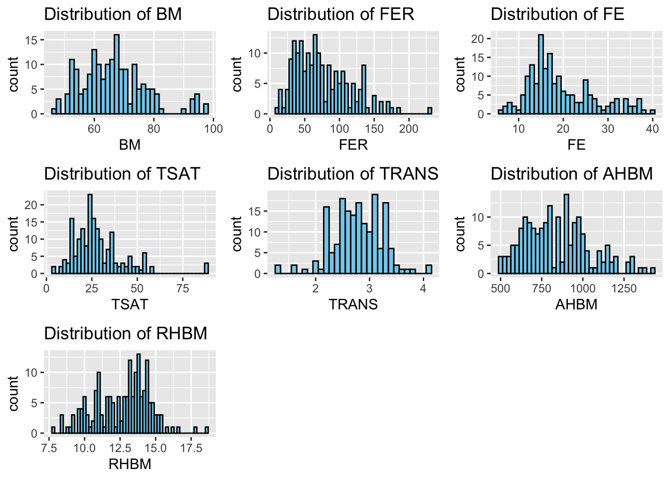
# Load required librarieslibrary(ggplot2)library(gridExtra)library(dplyr)# Clean the dataset by removing rows with any non-finite valuespre_exposure_data <- pre_exposure_data %>%filter(across(everything(), is.finite))# Create a dataframe to store variable names and bin widthscont_var_distrib <-data.frame(var =c("BM", "FER", "FE", "TSAT", "TRANS", "AHBM", "RHBM"),bin_width =c(1.5, 5, 1, 2, 0.1, 25, 0.2) # Specify appropriate bin widths)# List to store individual plotshistograms <-list()# Loop through the dataframe to create plots for each variablefor (i in1:nrow(cont_var_distrib)) { var_name <-as.character(cont_var_distrib[i, "var"]) bin_w <- cont_var_distrib[i, "bin_width"] plot <-ggplot(pre_exposure_data, aes(x =!!sym(var_name))) +geom_histogram(binwidth = bin_w, fill ="skyblue", color ="black") +labs(title =paste("Distribution of", var_name)) # Plot title histograms[[i]] <- plot # Store the plot in the list}# Arrange the plots in a grid for a clearer visualizationgridExtra::grid.arrange(grobs = histograms, ncol =3) # 3 columns of plots
With this approach, we create histograms for the key continuous variables in a more automated way, allowing us to quickly understand their distributions.
4.2.2 Understanding Distribution Characteristics
After visualizing the distributions with histograms, it’s crucial to understand what these shapes and patterns tell us about our data. Certain characteristics of distributions are particularly informative:
Normal Distribution: A normal distribution, also known as a Gaussian distribution, is symmetrical and forms a bell-shaped curve when plotted. In a perfectly normal distribution, the mean, median, and mode are all equal, and data falls evenly on both sides of the mean.
Skewness: Skewness measures the asymmetry of the probability distribution of a real-valued random variable.
Positive Skew (Right-skewed): Most data falls to the left of the mean with a long tail extending to the right. The mean is typically greater than the median.
Negative Skew (Left-skewed): Most data falls to the right of the mean with a long tail extending to the left. The mean is typically less than the median.
Peakedness (Kurtosis): Kurtosis measures the ‘tailedness’ of the distribution.
High Kurtosis (Leptokurtic): Distributions with sharp peaks and heavy tails, indicating outliers.
Low Kurtosis (Platykurtic): Distributions with flatter peaks and thinner tails, suggesting a lack of outliers.
Normal Kurtosis: Similar to the normal distribution, with a kurtosis value close to 3.
Understanding these concepts is essential for analyzing variable distributions because they can influence conclusions drawn from the data and the selection of appropriate statistical tests or models.
Let’s compute and interpret skewness and kurtosis for our key variables to analyze their distribution characteristics:
library(moments)library(tidyr)# Compute skewness and kurtosis for each numeric variableskewness_kurtosis <- pre_exposure_data %>%select_if(is.numeric) %>%summarise(across(everything(), list(Skewness =~skewness(., na.rm =TRUE),Kurtosis =~kurtosis(., na.rm =TRUE) -3# Excess kurtosis )))# Convert the summary from wide to long formatskewness_kurtosis_long <- skewness_kurtosis %>%pivot_longer(cols =everything(),names_to ="Measurement",values_to ="Value") %>%separate(Measurement, into =c("Variable", "Metric"), sep ="_") %>%pivot_wider(names_from ="Metric", values_from ="Value")skewness_kurtosis_long
# A tibble: 8 × 3
  Variable Skewness Kurtosis
  <chr>       <dbl>    <dbl>
1 ID          0      -1.20
2 BM          0.747   0.548
3 FER         0.866   0.541
4 FE          0.864   0.0895
5 TSAT        1.61    4.35
6 TRANS      -0.226   0.705
7 AHBM        0.520  -0.166
8 RHBM       -0.212  -0.178
With skewness and kurtosis computed for each variable in our pre-exposure dataset, we can dive deeper into the distribution characteristics:
Body Mass (BM): With a skewness of 0.747, BM displays a moderate right skew, suggesting the presence of athletes with higher body mass values in our sample. The kurtosis of 0.548 indicates a slightly more peaked distribution than normal, which might imply a greater variability of BM among athletes.
Ferritin (FER): The skewness value of 0.866 denotes a moderate right skew, indicating that some athletes have higher ferritin levels, which could reflect individual variations in iron metabolism or the effects of supplementation. The kurtosis close to zero suggests a distribution with tails similar to a normal distribution.
Iron (FE): Similar to FER, FE’s skewness of 0.864 shows a moderate right skew, which may correlate with individual differences in dietary intake or absorption. The low kurtosis value suggests a relatively normal distribution of tails, with no significant outliers.
Transferrin Saturation (TSAT): The skewness of 1.61 shows a more pronounced right skew, hinting at a subset of athletes with particularly high TSAT levels, potentially indicative of specific physiological or supplementation effects. The high kurtosis of 4.35 indicates a leptokurtic distribution, reflecting notable outliers or extreme values.
Transferrin (TRANS): The slight negative skewness of -0.226 might suggest a small number of athletes with lower transferrin levels. A kurtosis of 0.705 indicates a slightly leptokurtic distribution, with a modest presence of outliers.
Absolute Hemoglobin Mass (AHBM): A skewness of 0.520 suggests a mild right skew in AHBM levels among athletes. The negative kurtosis of -0.166 indicates a platykurtic distribution, which means the tails are lighter than a normal distribution, suggesting fewer extreme values.
Relative Hemoglobin Mass (RHBM): The small negative skewness of -0.212 indicates a distribution with a slight tail to the left. The negative kurtosis of -0.178 implies a distribution that is slightly flatter than normal, with a wide range of values relatively evenly distributed.
By examining both skewness and kurtosis, we gain insights into not just the symmetry of our data distributions, but also the presence of outliers and the concentration of data around the mean. For instance, TSAT’s higher kurtosis and skewness might warrant further investigation into specific training or health interventions that could influence iron metabolism. Similarly, understanding the spread in BM could be vital for tailoring nutritional and training programs to individual athletes.
These distributional insights provide us with valuable clues about the underlying processes and variations within our athlete cohort. They guide us towards more targeted inquiries and help us tailor our analyses and recommendations to the specific needs and characteristics of our sample population.
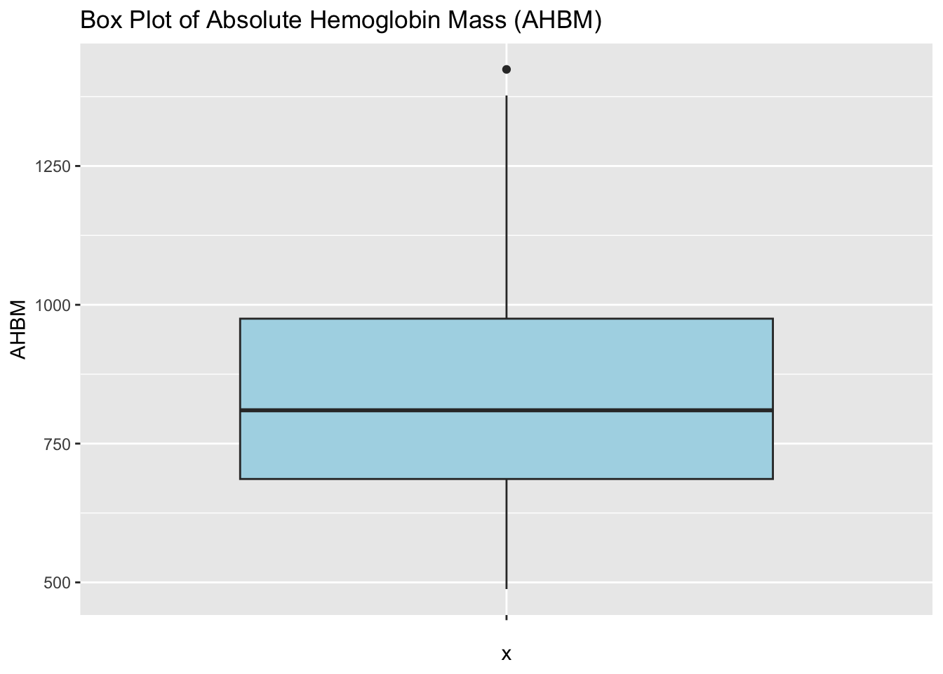
4.2.4 Visualizing Quantitative Variables with Box Plots
Box plots are another method for visualizing the distribution and spread of continuous variables. They provide a concise summary of the minimum, 1st quartile, median, 3rd quartile, and maximum, along with identifying potential outliers.
# Create box plots for the quantitative variablesbox_plot <-ggplot(pre_exposure_data, aes(x ="", y = AHBM)) +geom_boxplot(fill ="lightblue") +labs(title ="Box Plot of Absolute Hemoglobin Mass (AHBM)")print(box_plot) # Display the box plot
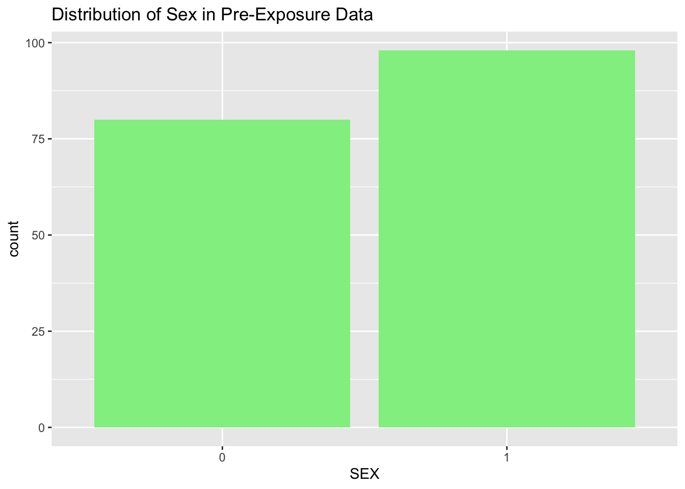
4.2.5 Visualizing Categorical Variables with Bar Plots
For categorical variables, bar plots are commonly used to visualize the frequency or proportion of values in each category. This is useful for understanding the distribution of categorical data and identifying imbalances.
# Create a bar plot for the categorical variable 'SEX'bar_plot <-ggplot(pre_exposure_data, aes(x = SEX)) +geom_bar(fill ="lightgreen") +labs(title ="Distribution of Sex in Pre-Exposure Data")print(bar_plot) # Display the bar plot
This graphical univariate analysis provides an accessible and informative way to explore variable distributions in our pre-exposure dataset. These methods serve as the foundation for further analysis and can guide the direction of subsequent bivariate and multivariate analyses.
4.2.6 Comparing Pre and Post Exposure Variable Distributions
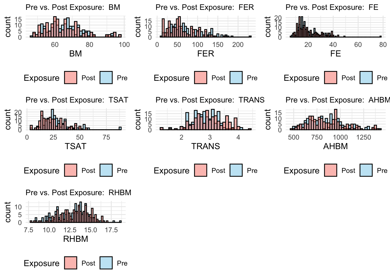
Building upon our understanding of the individual variable characteristics in the pre-exposure dataset, we now extend our graphical analysis to compare these distributions directly with their post-exposure counterparts. This comparison provides a visual assessment of the changes, if any, that occur in response to moderate altitude exposure and iron supplementation.
To facilitate this comparison, we overlaid histograms for key variables, color-coding the pre-exposure (skyblue) and post-exposure (salmon) data. This overlay offers a side-by-side distributional perspective, allowing us to observe shifts in central tendency, changes in variability, and the emergence or reduction of skewness.
# Create a combined dataset with an additional column indicating the exposure typecombined_data <-bind_rows(mutate(pre_exposure_data, Exposure ='Pre'),mutate(post_exposure_data, Exposure ='Post'))# Specify the variables and their corresponding bin widthsvariables <-c("BM", "FER", "FE", "TSAT", "TRANS", "AHBM", "RHBM")bin_widths <-c(1.5, 5, 1, 2, 0.1, 25, 0.2)# Initialize an empty list to store plotsplots_list <-list()# Loop through the variables to create overlay histogramsfor (i inseq_along(variables)) { variable_name <- variables[i] bin_width <- bin_widths[i]# Generate the overlay histogram for the current variable using tidy evaluation p <-ggplot(combined_data, aes(x = .data[[variable_name]], fill = Exposure)) +geom_histogram(data =filter(combined_data, Exposure =='Pre'), binwidth = bin_width, alpha =0.5, position ='identity', color ='black') +geom_histogram(data =filter(combined_data, Exposure =='Post'), binwidth = bin_width, alpha =0.5, position ='identity', color ='black') +labs(title =paste("Pre vs. Post Exposure: ", variable_name)) +scale_fill_manual(values =c("Pre"="skyblue", "Post"="salmon")) +theme_minimal() +theme(legend.position ="bottom", plot.title =element_text(size =10))# Add the plot to the list plots_list[[i]] <- p}# Arrange the generated plots in a gridgrid_plot <- gridExtra::grid.arrange(grobs = plots_list, ncol =3)
Body Mass (BM): The BM histograms show a consistent distribution between pre and post-exposure, suggesting that the exposure period did not significantly alter athletes’ body mass.
Ferritin (FER): There is a slight shift to the right in the post-exposure FER distribution, implying an increase in ferritin levels which could be attributed to the body’s response to altitude training or iron supplementation.
Iron (FE): The overlay indicates a similar distribution for FE levels with a slight increase in higher values post-exposure.
Transferrin Saturation (TSAT): Post-exposure, there appears to be a reduction in higher TSAT values, suggesting a possible utilization of iron stores during altitude exposure.
Transferrin (TRANS): The distributions before and after exposure are closely aligned, indicating stability in this variable across the study period.
Absolute Hemoglobin Mass (AHBM): The AHBM shows a slight increase in higher values post-exposure, which may reflect the physiological adaptations associated with altitude training aimed at increasing hemoglobin mass.
Relative Hemoglobin Mass (RHBM): The overlay suggests minimal changes in the distribution of RHBM, implying a consistent relative hemoglobin mass before and after exposure.
With this visual approach, we’ve not only characterized individual variables but have also begun to uncover the narrative of how moderate altitude exposure may impact these athletes’ hematological profiles.
5 Bivariate and Multivariate Analysis
In sports science, uncovering the interplay between different physiological and performance-related variables can provide powerful insights. By analyzing relationships between two or more variables, we can better understand how they collectively influence athlete performance and adapt our training or nutrition programs accordingly.
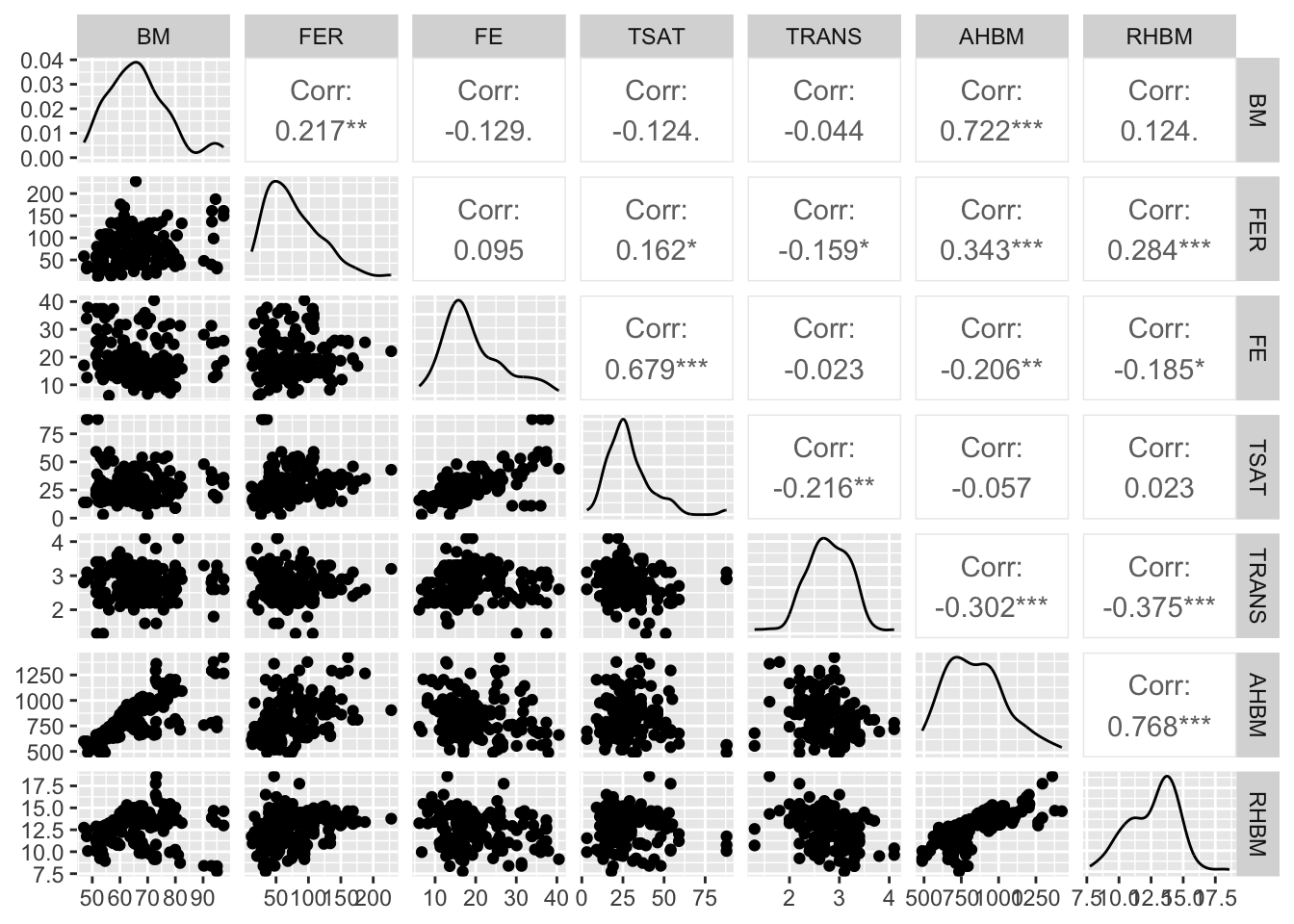
5.1 Pairwise Scatter Plots
Pairwise scatter plots offer a visual examination of the relationship between two continuous variables. This form of analysis is pivotal for spotting trends, correlations, or outliers that could indicate a meaningful interaction affecting athlete outcomes.
For an expansive overview, we can create a grid of scatter plots that map the relationships between multiple variables simultaneously:
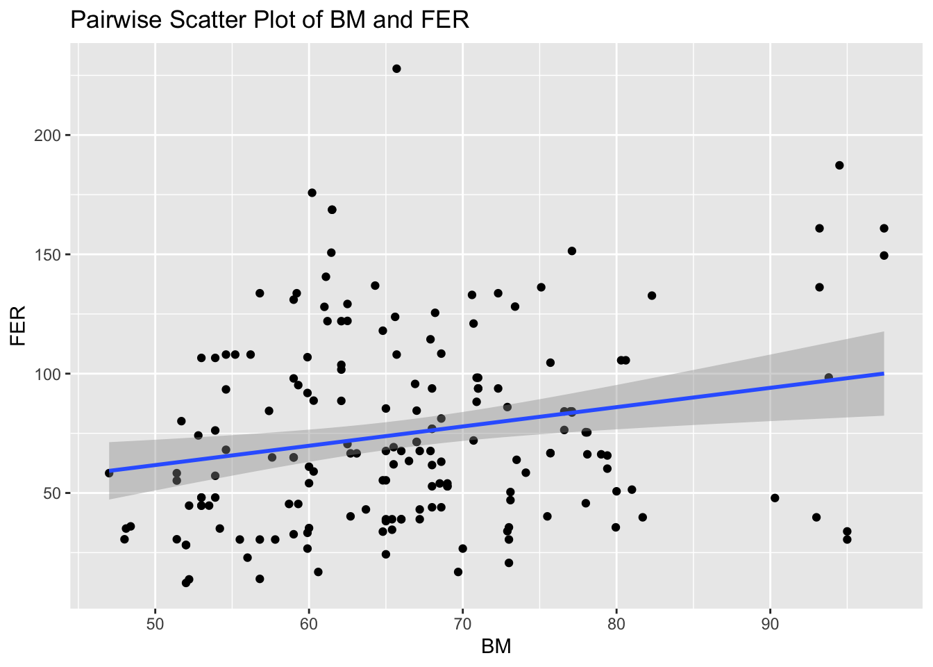
Alternatively, we can focus on individual relationships, such as body mass (BM) and ferritin (FER), to gain a more detailed understanding:
# Individual pairwise scatter plot with body mass (BM) and ferritin (FER)ggplot(pre_exposure_data, aes(x = BM, y = FER)) +geom_point() +geom_smooth(method ="lm", se =TRUE) +labs(title ="Pairwise Scatter Plot of BM and FER")
Both methods have their uses: the grid provides a broad snapshot suitable for initial explorations, while individual plots allow for a more concentrated look at specific interactions.
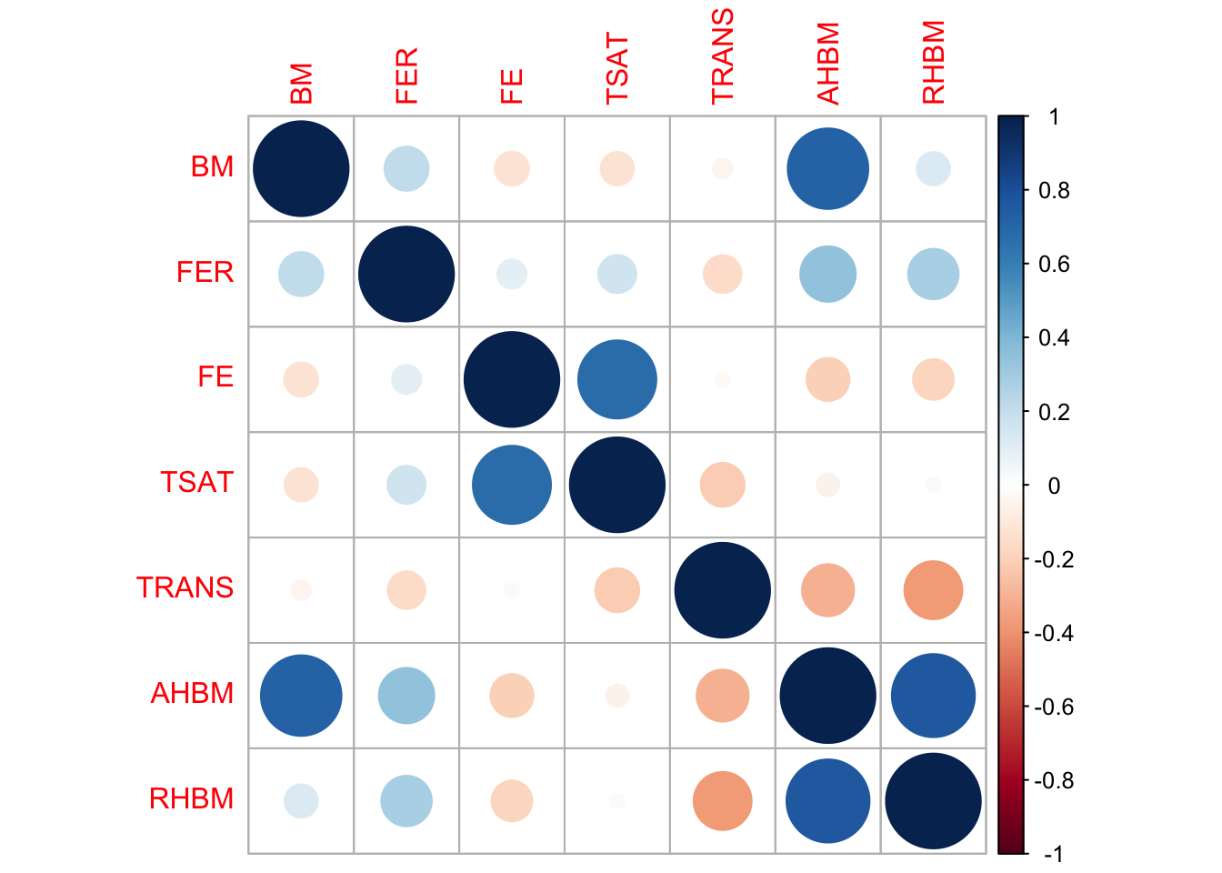
5.2 Correlation Matrix
The correlation matrix is an invaluable tool in sports science research, offering quantifiable evidence of how closely related different variables are. This can be crucial when identifying which factors might predict or influence an athlete’s performance and physiological responses. A correlation matrix provides a quick reference to understand these relationships and can guide further, more focused analysis.
Here’s how we compute and visualize the correlation matrix using our pre-exposure data:
# Computing the correlation matrix for selected variablescor_matrix <-cor(pre_exposure_data %>%select(BM, FER, FE, TSAT, TRANS, AHBM, RHBM), use ="complete.obs")# Visualizing the correlation matrix with a circle representationcorrplot::corrplot(cor_matrix, method ="circle")
Each cell in the matrix represents the correlation coefficient between two variables, ranging from -1 (perfect negative correlation) to +1 (perfect positive correlation), with 0 indicating no linear relationship. This visual approach allows practitioners to quickly identify which variables warrant further scrutiny and analysis.
Analysing our example dataset, we see that a prominent dark blue circle between AHBM and BM indicates a strong positive correlation, suggesting that body mass may influence absolute hemoglobin mass, a vital parameter for athlete endurance. This strong association merits further exploration to understand its implications on performance.
Conversely, the red circle between AHBM and TRANS points to a notable negative correlation, hinting at an inverse relationship between hemoglobin mass and transferrin levels. This inverse correlation could lead to inquiries about how iron transport proteins are modulated in response to endurance training.
This correlation matrix visualizes which pairs of variables have stronger linear relationships and may thus be key focal points for developing strategies to optimize athlete health and performance in response to training stimuli.
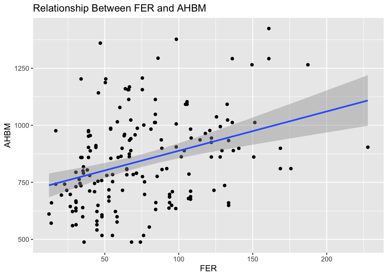
5.3 Investigating Relationships with the Dependent Variable
In exploring bivariate relationships, it’s particularly insightful to look at how various independent variables relate to a dependent variable of interest. For sports scientists, understanding factors that potentially influence key metrics like absolute hemoglobin mass (AHBM) can directly inform training and health strategies.
Let’s illustrate this with a scatter plot examining the relationship between ferritin levels (FER) and AHBM:
# Scatter plot of ferritin (FER) against absolute hemoglobin mass (AHBM)ggplot(pre_exposure_data, aes(x = FER, y = AHBM)) +geom_point() +geom_smooth(method ='lm', se =TRUE) +labs(title ="Relationship Between FER and AHBM")
This plot not only depicts individual data points but also includes a trend line that summarizes the relationship between FER and AHBM, complete with a shaded area representing the standard error. Such visualizations can highlight potential predictive variables or areas that may benefit from targeted interventions.
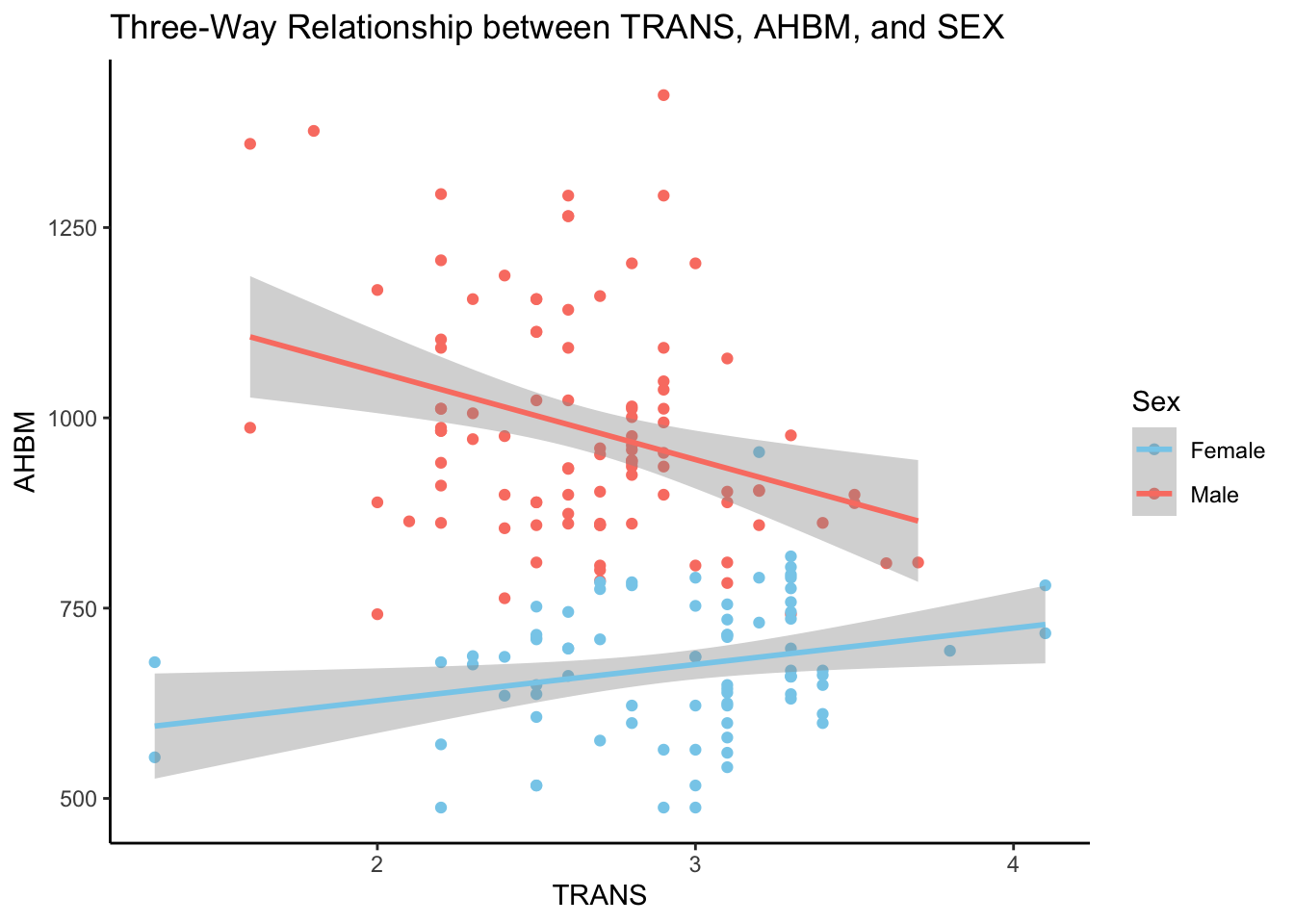
5.4 Visualizing Three-Way Relationships
By incorporating additional variables into our bivariate plots, we can observe the dynamics of three-way relationships. Such insights are particularly valuable in sports science, where factors like sex can influence physiological responses to training.
Consider the relationship between transferrin (TRANS), absolute hemoglobin mass (AHBM), and sex (SEX). These three variables can interact in complex ways that might impact an athlete’s ability to process and utilize iron — a critical component for oxygen delivery and endurance.
# Three-way relationship between transferrin (TRANS), AHBM, and SEXggplot(pre_exposure_data, aes(x = TRANS, y = AHBM, color =as.factor(SEX))) +geom_point() +# Scatter plot pointsgeom_smooth(method ='lm', se =TRUE) +# Linear model fit line with standard errorscale_color_manual(values =c("skyblue", "salmon"),labels =c("Female", "Male"),name ="Sex") +labs(title ="Three-Way Relationship between TRANS, AHBM, and SEX") +theme_classic() # Clean classic theme for better readability
The plot reveals a divergent relationship between transferrin (TRANS) and absolute hemoglobin mass (AHBM) across sexes. For female athletes, there is a positive trend where AHBM increases with higher TRANS levels. Conversely, male athletes exhibit a negative trend, with AHBM decreasing as TRANS levels rise. This contrast highlights the importance of considering sex-specific physiological responses in sports science research and training regimens.
5.5 Handling Associated Variables and Covariance
In sports science, understanding the association between variables is vital for predicting outcomes such as performance or recovery times. Association means that knowledge about the value of one variable gives some information about the value of another. For instance, the number of hours spent training may be associated with improvements in endurance performance.
Covariance provides a measure of how much two variables change together. If the covariance is positive, it indicates that as one variable increases, the other tends to increase as well. A negative covariance implies an inverse relationship. Unlike correlation, covariance does not have a standardized range, so it cannot convey the strength of the relationship, only its direction. In contrast, correlation normalizes the covariance to a value between -1 and 1, providing a clearer indication of how strong the relationship is. In R, we can calculate covariance using the cov() function from the stats package.
5.6 Exploring Non-linear Associations
Correlation and covariance are measures of linear association, meaning they can only capture straight-line relationships. Non-linear associations, where changes in one variable relate to non-proportional changes in another, require different analytical approaches. For example, the effect of training intensity on injury risk might be non-linear, with risk plateauing or even decreasing after a certain point.
Scatter plots are a simple yet effective way to visualize potential non-linear relationships. If the pattern of points on the plot isn’t straight, it might indicate a non-linear association. For plotting these relationships, ggplot2 provides an excellent toolset with functions like geom_point() and geom_smooth() for a smooth curve that captures the nature of the non-linear relationship.
5.7 Contingency Tables and Chi-Square Statistics
Contingency tables are a way of summarizing the relationship between categorical variables. They display the frequency distribution of variables and can reveal patterns that suggest associations. For example, injury rates might differ between athletes of different age groups.
The Chi-Square statistic is a measure derived from contingency tables, used to assess whether observed frequencies differ from expected frequencies — essentially testing for an association between categorical variables. In R, the chisq.test() function in the stats package provides an easy way to calculate this statistic.
Each of these statistical concepts mentioned in the three subsections above allows sports scientists to delve deeper into their data, uncovering relationships that might not be immediately apparent and providing a more nuanced understanding of the factors that contribute to athletic performance and well-being.
5.8 Visual Comparisons of Groups
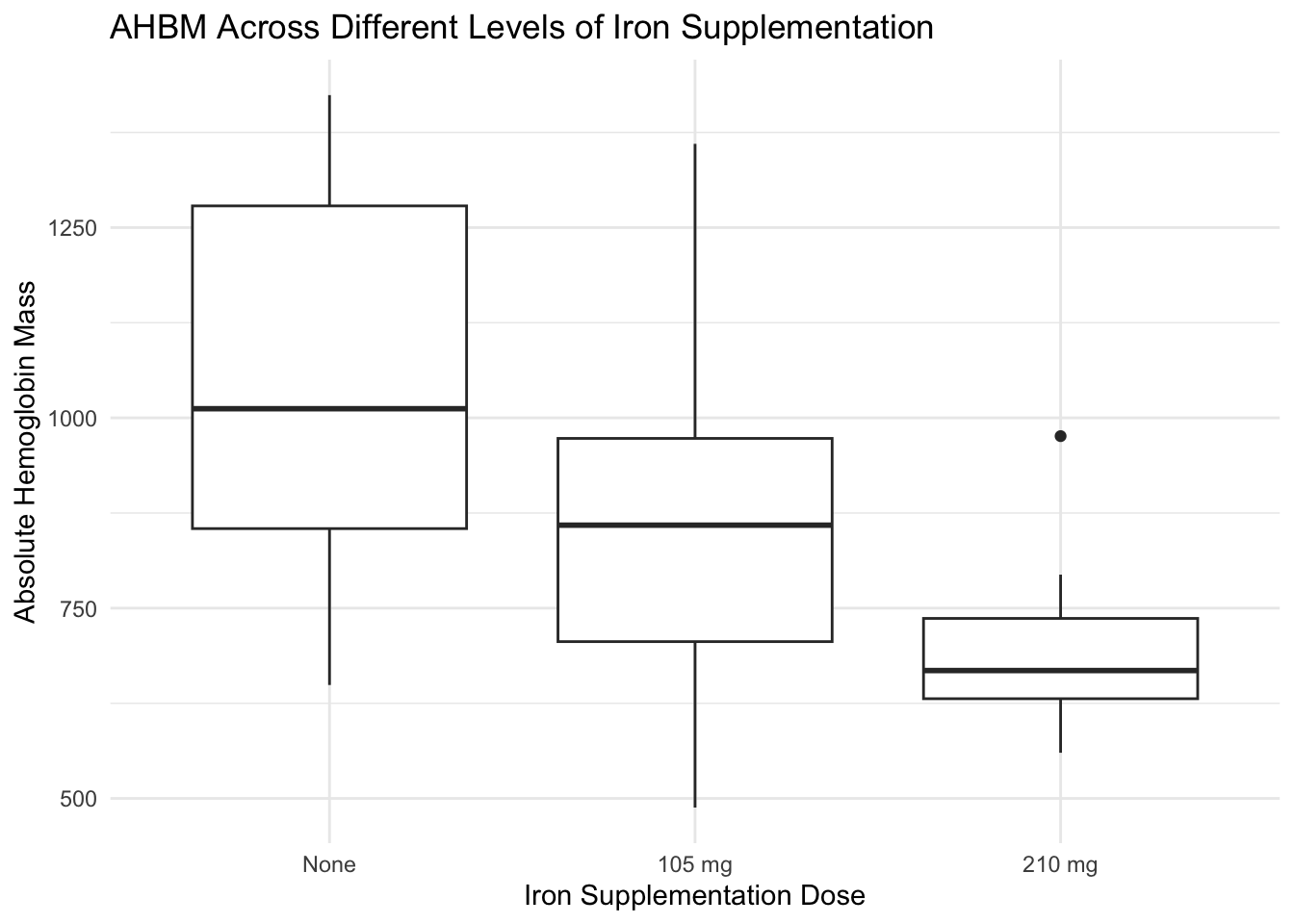
When exploring the data, it’s beneficial to compare groups visually. Side-by-side box plots and overlaid histograms are particularly effective for this purpose. They allow us to compare the central tendency and variability of a quantitative variable across different categories of a related factor. For sports and exercise scientists, these visualizations can highlight how different treatments or conditions affect athlete physiology.
# Side-by-side box plots of AHBM across different levels of iron supplementation (SUP_DOSE)ggplot(pre_exposure_data, aes(x =factor(SUP_DOSE, labels =c("None", "105 mg", "210 mg")), y = AHBM)) +geom_boxplot() +labs(x ="Iron Supplementation Dose", y ="Absolute Hemoglobin Mass", title ="AHBM Across Different Levels of Iron Supplementation") +theme_minimal()
The box plots reveal that athletes not receiving any iron supplementation have a wider range and higher median of absolute hemoglobin mass (AHBM) compared to those receiving supplementation. Athletes receiving 105 mg of iron show a tighter distribution of AHBM, whereas those on a higher dose of 210 mg exhibit the lowest median AHBM. This suggests a potential inverse relationship between the dose of iron supplementation and hemoglobin mass, worthy of further investigation.
To conclude this section, bivariate and multivariate analyses are key in uncovering the multifaceted relationships inherent in sports science data. They lay the groundwork for hypothesis formation and deeper investigation, ultimately guiding targeted interventions and informed decision-making.
6 Conclusion and Reflection
In this lesson, we’ve delved deeply into Exploratory Data Analysis (EDA), a cornerstone of effective data utilization in sport science. We explored various techniques to analyze and visualize data, uncovering underlying structures and vital insights that influence athlete performance and health.
Through the use of R and its extensive toolkit for EDA, we’ve demonstrated how to interpret complex data sets, identify trends, and assess the impact of variables like altitude and supplementation on athlete health. This process has not only enhanced our understanding of data analysis techniques but also highlighted the dynamic nature of EDA in adapting to new data and evolving research questions.
As you continue to apply these EDA strategies to your own sport science projects, you’ll find they are indispensable for making informed decisions and fostering evidence-based practices. Each skill refined and insight gained through this lesson adds a layer of sophistication to your analytical capabilities, setting the stage for future discoveries and innovations in the field.
7 Knowledge Spot-Check
What is the primary purpose of Exploratory Data Analysis (EDA) in sport science?
A) To confirm existing hypotheses. B) To detect patterns and test assumptions without prior hypotheses. C) To present finalized research findings. D) To produce detailed statistical models.
Expand to see the correct answer.
The correct answer is B) To detect patterns and test assumptions without prior hypotheses.
Which R package did we use to load the HbmassSynth dataset?
A) ggplot2 B) dplyr C) skimr D) speedsR
Expand to see the correct answer.
The correct answer is D) speedsR.
Why is it important to assess skewness and kurtosis in data distributions during EDA?
A) To determine the correct application of linear models. B) To understand the symmetry and tail behavior of the distribution. C) To ensure the data fits within a specific size limit. D) To enhance the visual appeal of data plots.
Expand to see the correct answer.
The correct answer is B) To understand the symmetry and tail behavior of the distribution.
What does a correlation matrix help identify in sport science data analysis?
A) Outliers and anomalies only. B) The strength and direction of relationships between variables. C) The exact predictive models to be used. D) The best graphical representation.
Expand to see the correct answer.
The correct answer is B) The strength and direction of relationships between variables.
Why are overlay histograms useful when comparing pre and post intervention data?
A) They confirm the data is error-free. B) They show changes in data distributions over time. C) They reduce the data set size. D) They automate the data cleaning process.
Expand to see the correct answer.
The correct answer is B) They show changes in data distributions over time.