Dimensionality Reduction in Sport and Exercise Science
Exploring PCA, Factor Analysis, and Their Applications in High-Dimensional Data
Abstract
This lesson introduces dimensionality reduction techniques with a focus on their theoretical foundations, practical applications, and relevance in sports science. The lesson explores methods such as Principal Component Analysis (PCA) and Factor Analysis (FA), guiding practitioners in reducing data dimensionality while preserving essential information. Using R and practical examples, you will learn to implement these techniques, interpret results, and apply them effectively to analyze high-dimensional datasets in the context of sport and exercise science.
Keywords
Dimensionality reduction, Principal Component Analysis (PCA), Factor Analysis, linear algebra, data visualization, sports science, high-dimensional data, R programming, data analysis, diagnostics, feature extraction.
Lesson’s Level
The level of this lesson is categorized as SILVER.
Lesson’s Main Ideas
- Understand the theoretical foundations of dimensionality reduction.
- Learn to implement and visualize results of dimensionality reduction techniques like PCA and Factor Analysis. Apply dimensionality reduction methods in R to real-world sports science datasets.
1 Learning Outcomes
By the end of this lesson, you will develop the ability to:
Understand Dimensionality Reduction Concepts: Grasp the mathematical and conceptual underpinnings of dimensionality reduction techniques, including their applications in simplifying high-dimensional data.
Implement PCA and Factor Analysis in R: Use R to perform Principal Component Analysis (PCA) and Factor Analysis (FA), leveraging their strengths to explore and interpret data.
Analyze and Interpret Results: Gain proficiency in analyzing outputs of dimensionality reduction techniques, understanding variance explained, loadings, and visualization strategies.
Apply Dimensionality Reduction in Sport Science Contexts: Utilize these methods effectively to address challenges in analyzing high-dimensional datasets within sport and exercise science.
2 Background Knowledge
Some background knowledge of vectors, matrices, and basic linear algebra is needed to understand many of the most common dimensionality reduction techniques, such as PCA. This section of the tutorial aims to introduce these concepts in a (mostly) non-technical way.
2.0.1 What Is The “Dimensionality” Of A Dataset?
The dimensionality of a dataset refers to the number of values (or variables) used to describe each object or observation within that dataset. For example, a dataset comprising strength testing results from the squat, bench press, and deadlift for a group of athletes has a dimensionality of 3 because each observation is described by 3 values. A dataset composed of 64 x 64 pixel grayscale images has a dimensionality of 4096 because each image is described by 64 × 64 = 4096 pixel intensity values.
2.0.2 Observations As Vectors
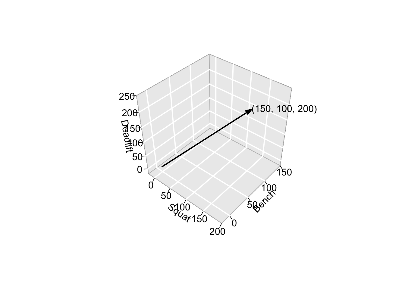
It is useful to think of observations within a dataset as vectors. A vector is a mathematical object with both magnitude and direction. Using the same example data as above: the observation of an athlete that lifted 150kg in the squat, 100kg in the bench press, and 200kg in the deadlift can be thought of as a 3-dimensional vector describing the point \(\bigl[\begin{smallmatrix} 150 \\ 100 \\ 200 \end{smallmatrix} \bigr]\) in 3-dimensional space. This point can be reached by going:
- 150 units in the “direction” of squat,
- 100 units in the “direction” of bench press, and
- 200 units in the “direction” of deadlift.
This concept is visually intuitive in up to 3 dimensions but still applies in higher dimensions. For example, if five more strength tests were added to our dataset, each observation would be described by an 8-dimensional vector. Or, if our dataset contained force-plate time series measurements from countermovement jumps normalized to 1000 time points, each observation would be a 1000-dimensional vector.
2.0.3 Basis Vectors
When describing the location of our observation at \(\bigl[\begin{smallmatrix} 150 \\ 100 \\ 200 \end{smallmatrix} \bigr]\), it was implicit that we were using the standard basis vectors for a 3-dimensional space. These are:
\[ \left\{ \mathbf{i} = \begin{bmatrix} 1\\ 0\\ 0 \end{bmatrix} , \mathbf{j} = \begin{bmatrix} 0\\ 1\\ 0 \end{bmatrix} , \mathbf{k} = \begin{bmatrix} 0\\ 0\\ 1 \end{bmatrix} \right\}. \] A basis vector is like a building block for describing points in space. We can combine these basis vectors in different amounts to reach any point in our space. They give us a way to break down complex positions into simpler parts. Using the standard basis vectors, our observation is represented as:
\[ \begin{split} \begin{bmatrix} 150\\ 100\\ 200 \end{bmatrix} &= 150 \cdot \mathbf{i} + 100 \cdot \mathbf{j} + 200 \cdot \mathbf{k} \\ &= 150 \cdot \begin{bmatrix} 1\\ 0\\ 0 \end{bmatrix} + 100 \cdot \begin{bmatrix} 0\\ 1\\ 0 \end{bmatrix} + 200 \cdot \begin{bmatrix} 0\\ 0\\ 1 \end{bmatrix}. \end{split} \]
However, the standard basis is not the only possible set of basis vectors. Many other sets can describe points in a 3D space. For example, the following vectors also form a basis for 3D space:
\[ \left\{ \mathbf{u} = \begin{bmatrix} 3\\ 1\\ 1 \end{bmatrix} , \mathbf{v} = \begin{bmatrix} -1\\ 2\\ 1 \end{bmatrix} , \mathbf{w} = \begin{bmatrix} -1/2\\ -2\\ 7/2 \end{bmatrix} \right\}. \]
Using these basis vectors, our observation can be described as:
\[ \begin{bmatrix} 750/11\\ 125/3\\ 850/33 \end{bmatrix}, \]
since
\[ \begin{split} \frac{750}{11} \cdot \mathbf{u} + \frac{125}{3} \cdot \mathbf{v} + \frac{850}{33} \cdot \mathbf{w} &= \frac{750}{11} \cdot \begin{bmatrix} 3\\ 1\\ 1 \end{bmatrix} + \frac{125}{3} \cdot \begin{bmatrix} -1\\ 2\\ 1 \end{bmatrix} + \frac{850}{33} \cdot \begin{bmatrix} -1/2\\ -2\\ 7/2 \end{bmatrix} \\ &= \begin{bmatrix} \frac{750}{11}\times3-\frac{125}{3} - \frac{850}{33}\times\frac{1}{2}\\ \frac{750}{11}+\frac{125}{3}\times2 - \frac{850}{33}\times2\\ \frac{750}{11}+\frac{125}{3} + \frac{850}{33}\times\frac{7}{2} \end{bmatrix} \\ &= \begin{bmatrix} 150\\ 100\\ 200 \end{bmatrix}. \end{split} \]
Thus, while the coordinates change under a different basis, the information remains the same. A change of basis operation transforms vectors to a new coordinate system, offering different perspectives on the data while preserving their underlying meaning.
It may not be immediately clear why using anything other than the standard basis vectors may be useful, but the concept of a basis transformation is central to many dimensionality reduction techniques.
2.0.4 Datasets As Matrices
After making the connection between observations and vectors, it is also necessary to link datasets and matrices. Consider the following simulated dataset of strength testing results, which includes the observation at \(\bigl[\begin{smallmatrix} 150 \\ 100 \\ 200 \end{smallmatrix} \bigr]\) in the first row.
| ID | Squat | Bench | Deadlift |
|---|---|---|---|
| Athlete_1 | 150 | 100 | 200 |
| Athlete_2 | 127 | 95 | 124 |
| Athlete_3 | 99 | 63 | 241 |
| Athlete_4 | 155 | 101 | 195 |
| Athlete_5 | 143 | 110 | 272 |
| Athlete_6 | 121 | 55 | 162 |
| Athlete_7 | 174 | 84 | 237 |
| Athlete_8 | 116 | 100 | 177 |
| Athlete_9 | 152 | 90 | 150 |
| Athlete_10 | 117 | 94 | 220 |
This dataset has 10 observations (rows) and a dimensionality of 3 because each observation is described by 3 values (meta-data such as IDs or date variables are not included in the dimensionality). Thus, it can be represented as a \(10 \times 3\) matrix (\(\mathcal{D}\)). A data matrix is a two-dimensional arrangement of numbers, where rows represent individual observations or samples, and columns represent different variables or features.
\[ \mathcal{D} = \begin{bmatrix} 150 & 100 & 200 \\ 127 & 95 & 124 \\ 99 & 63 & 241 \\ 155 & 101 & 195 \\ 143 & 110 & 272 \\ 121 & 55 & 162 \\ 174 & 84 & 237 \\ 116 & 100 & 177 \\ 152 & 90 & 150 \\ 117 & 94 & 220 \\ \end{bmatrix}. \]
This matrix representation makes it easy to perform various mathematical operations and analyses on the dataset, such as matrix multiplication, linear algebra operations, and statistical computations. It is a fundamental way of organizing and analyzing data, especially in fields such as machine learning and data science.
2.0.5 Basis Vectors in Datasets
When discussing dimensionality reduction, it is helpful to express the basis vectors in another matrix, where each row contains one of the basis vectors. This matrix will be of size \(N \times N\), where \(N\) is the dimensionality of the data. The dataset is constructed by multiplying these two matrices. Below is the dataset expressed using the standard basis vectors (shown in blue, red, and green):
\[ \mathcal{D} = \begin{bmatrix} \textit{150} & \textit{100} & \textit{200} \\ 127 & 95 & 124 \\ 99 & 63 & 241 \\ 155 & 101 & 195 \\ 143 & 110 & 272 \\ 121 & 55 & 162 \\ 174 & 84 & 237 \\ 116 & 100 & 177 \\ 152 & 90 & 150 \\ 117 & 94 & 220 \\ \end{bmatrix} \times \begin{bmatrix} \textcolor{blue}{1} & \textcolor{blue}{0} & \textcolor{blue}{0} \\ \textcolor{red}{0} & \textcolor{red}{1} & \textcolor{red}{0} \\ \textcolor{green}{0} & \textcolor{green}{0} & \textcolor{green}{1} \end{bmatrix}. \] However, as shown in the preceding sections, it is possible to express the data with respect to a different set of basis vectors. The same strength testing dataset is shown below, but using a different set of basis vectors:
\[ \mathcal{D} = \begin{bmatrix} \textit{750/11} & \textit{125/3} & \textit{850/33} \\ 600/11 & 187/6 & 361/33 \\ ... & ... & ... \\ & & \\ & & \\ & & \\ & & \\ ... & ... & ... \\ & & \\ 665/11 & 97/2 & 349/11 \\ \end{bmatrix} \times \begin{bmatrix} \textcolor{blue}{3} & \textcolor{blue}{1} & \textcolor{blue}{1} \\ \textcolor{red}{-1} & \textcolor{red}{2} & \textcolor{red}{1} \\ \textcolor{green}{-1/2} & \textcolor{green}{-2} & \textcolor{green}{-7/2} \end{bmatrix}. \] In this example, the non-standard basis vectors used do not have any specific relevance to the data, so the change of basis does not accomplish anything particularly useful. However, it is sometimes possible to construct new basis vectors that greatly simplify how the dataset can be represented.
3 Dimensionality Reduction Methods
Dimensionality reduction techniques seek to find new coordinate systems for expressing data. The goal is to capture as much information and structure in the data as possible using fewer values per observation, thereby lowering the dimensionality. There are many ways to accomplish this. The following sections explain the concepts behind common dimensionality reduction techniques (PCA and Factor Analysis). These sections also provide example code showing how to implement these methods in R, run diagnostics and visualizations, and interpret the results.
3.1 Principal Component Analysis (PCA)
Principal Component Analysis (PCA) is a method for finding a new coordinate system to express data, which is equivalent to finding a new set of basis vectors. Specifically, the PCA algorithm constructs the first basis vector to point in the direction of maximal variation in the data, the second in the direction of maximal variation with the constraint that it must be uncorrelated with the first, and so on. (See Chapter 12 of An Introduction to Statistical Learning available online here for more details.)
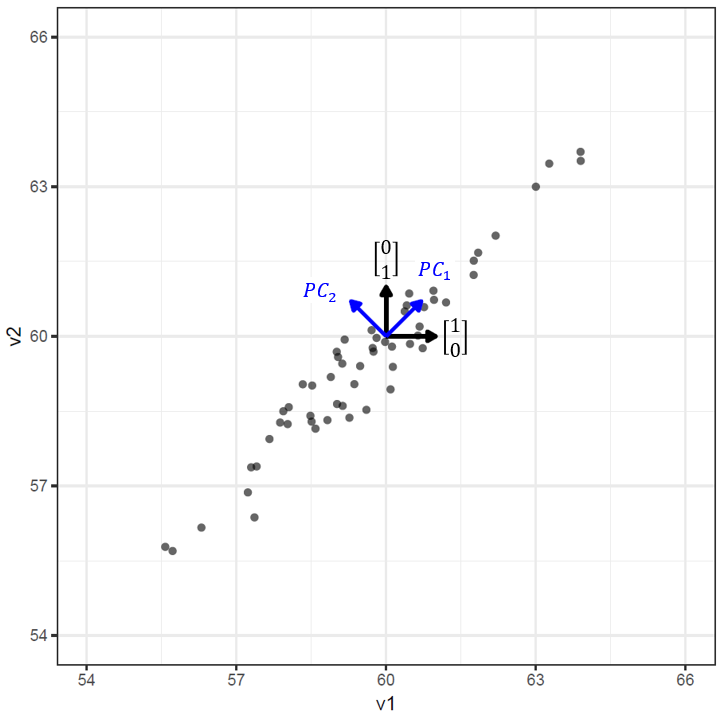
The concept of aligning new basis vectors with the variation present in the data can be visualized clearly in 2-dimensions. In the figure below, the raw data and standard basis vectors are shown in black, and the principal components (new basis vectors) are shown in blue. Loosely speaking, using the standard basis vectors on this dataset is like giving instructions in the form of “X steps to the right/left and Y steps up/down”, whereas using the principal components is like “P steps along the positive diagonal and Q steps along the negative diagonal.” Because of the strong correlation between these two variables, just giving the value of an observation along the \(PC_1\) direction (i.e. in 1-dimension) will allow us to know approximately where it is in 2-dimensions. This is the benefit of aligning the basis vectors with the direction of maximal variation - it can allow us to describe the location of the observations with fewer values, thus reducing the dimensionality of the data.
3.2 No Assumptions in PCA
There are no assumptions or requirements a dataset needs to meet before running PCA. However, there is no guarantee that the new coordinate system (basis vectors) will provide a useful or enlightening view of the data. Thus, PCA is mostly considered an exploratory analysis technique. It is particularly useful for visualizing high-dimensional data or as a pre-processing step for further analysis. PCA does not have an underlying model of how the data is generated.
3.2.1 Example: Decathlon Data
To work through PCA in R, we use a decathlon dataset available through the FactoMineR package:
A data frame with 41 rows and 13 columns: the first ten columns correspond to the performance of athletes in the 10 events of the decathlon. Columns 11 and 12 represent rank and points obtained, while the last column is a categorical variable indicating the sporting event (2004 Olympic Games or 2004 Decastar).
library(FactoMineR)
data(decathlon)
gt(head(decathlon[, 1:10]))| 100m | Long.jump | Shot.put | High.jump | 400m | 110m.hurdle | Discus | Pole.vault | Javeline | 1500m |
|---|---|---|---|---|---|---|---|---|---|
| 11.04 | 7.58 | 14.83 | 2.07 | 49.81 | 14.69 | 43.75 | 5.02 | 63.19 | 291.7 |
| 10.76 | 7.40 | 14.26 | 1.86 | 49.37 | 14.05 | 50.72 | 4.92 | 60.15 | 301.5 |
| 11.02 | 7.30 | 14.77 | 2.04 | 48.37 | 14.09 | 48.95 | 4.92 | 50.31 | 300.2 |
| 11.02 | 7.23 | 14.25 | 1.92 | 48.93 | 14.99 | 40.87 | 5.32 | 62.77 | 280.1 |
| 11.34 | 7.09 | 15.19 | 2.10 | 50.42 | 15.31 | 46.26 | 4.72 | 63.44 | 276.4 |
| 11.11 | 7.60 | 14.31 | 1.98 | 48.68 | 14.23 | 41.10 | 4.92 | 51.77 | 278.1 |
3.2.1.1 Preprocessing the Data
To ensure consistency, time-based results (100m, 400m, 1500m, and 110m hurdles) are converted to negative values. This ensures that higher numbers always correspond to better performance, and positive correlations between variables indicate that athletes who perform well in one event also tend to perform well in others.
dec_events <- decathlon %>%
  select(`100m`:`1500m`) %>%  # Select the first 10 columns with event results
  mutate(
    `100m` = -`100m`,
    `400m` = -`400m`,
    `1500m` = -`1500m`,
    `110m.hurdle` = -`110m.hurdle`
  )
In matrix notation, the processed dataset looks like this:
\[ \begin{bmatrix} -11.04 & 7.58 & 14.83 & 2.07 & -49.81 & -14.69 & 43.75 & 5.02 & 63.19 & -291.7 \\ -10.76 & 7.4 & 14.26 & 1.86 & -49.37 & -14.05 & 50.72 & 4.92 & 60.15 & -301.5 \\ -11.02 & 7.3 & 14.77 & 2.04 & -48.37 & -14.09 & 48.95 & 4.92 & 50.31 & -300.2 \\ -11.02 & 7.23 & 14.25 & 1.92 & -48.93 & -14.99 & 40.87 & 5.32 & 62.77 & -280.1 \\ -11.34 & 7.09 & 15.19 & 2.1 & -50.42 & -15.31 & 46.26 & 4.72 & 63.44 & -276.4 \\ -11.11 & 7.6 & 14.31 & 1.98 & -48.68 & -14.23 & 41.1 & 4.92 & 51.77 & -278.1 \\ ... & ... & ... & ... & ... & ... & ... & ... & ... & ... \\ \end{bmatrix} \] As with any dataset, the data is expressed in terms of the standard basis vectors. For instance, the first value in the first row, \(11.04\), indicates that the observation is “\(11.04\) units in the direction of the 100m event.” However, this value does not provide any explicit information about the athlete’s performance in other decathlon events. While a domain expert in athletics might use their experience to estimate an athlete’s results in other events based on this value, the data representation itself does not capture such relationships. These are precisely the scenarios where dimensionality reduction methods can be highly beneficial, as they are designed to uncover and leverage strong correlations or patterns within the data.
3.2.1.2 Investigating Correlations
Without relying on domain knowledge, it is also possible to examine the correlations within a dataset using visualizations. The Chart.Correlation() function from the PerformanceAnalytics package provides a lot of information about the dataset.
library("PerformanceAnalytics")
chart.Correlation(dec_events, histogram=TRUE)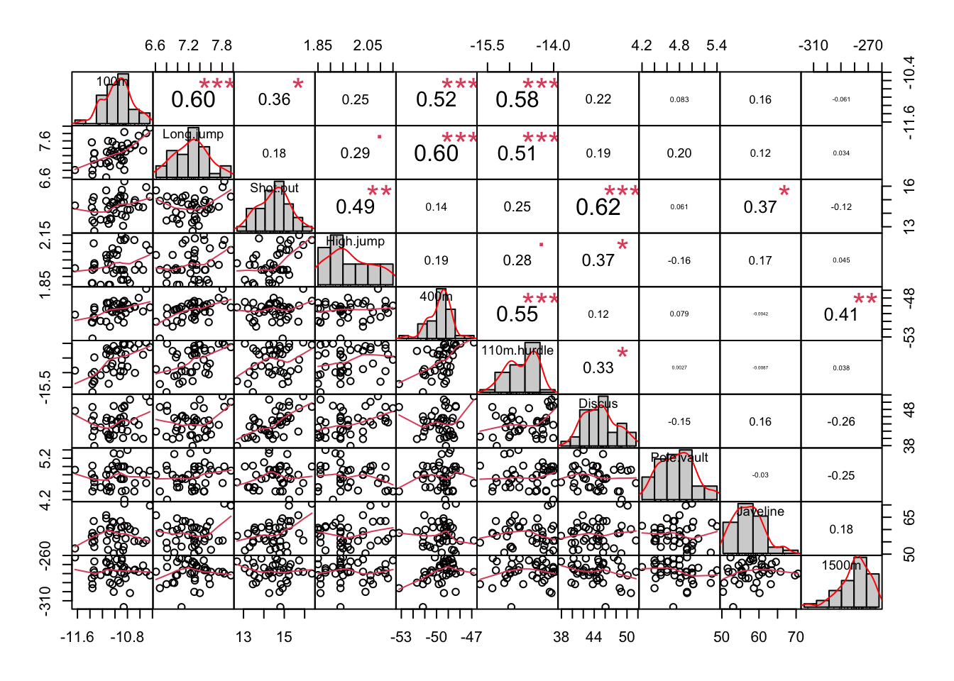
- Diagonal: Histograms of distributions for each event.
- Lower Triangle: Scatter plots of variable pairs.
- Upper Triangle: Correlation coefficients between variables.
Correlations reveal strong relationships, such as:
- Positive correlation between 100m, 400m, and 110m hurdles.
- Positive correlation between shot put and discus.
- Positive correlation between 400m and 1500m.
When working with datasets that have dimensionality in the hundreds or thousands, this level of detail can result in overly cluttered visualizations. An effective alternative is to represent the correlation matrix using a color gradient, which encodes the direction and strength of correlations between variables. The ggcorrplot package provides a straightforward way to create such visualizations. In these graphs, the presence of multiple dark red or blue tiles often signals strong correlations, suggesting that applying dimensionality reduction techniques may be beneficial.
library(ggcorrplot)
ggcorrplot(cor(dec_events), type = "upper")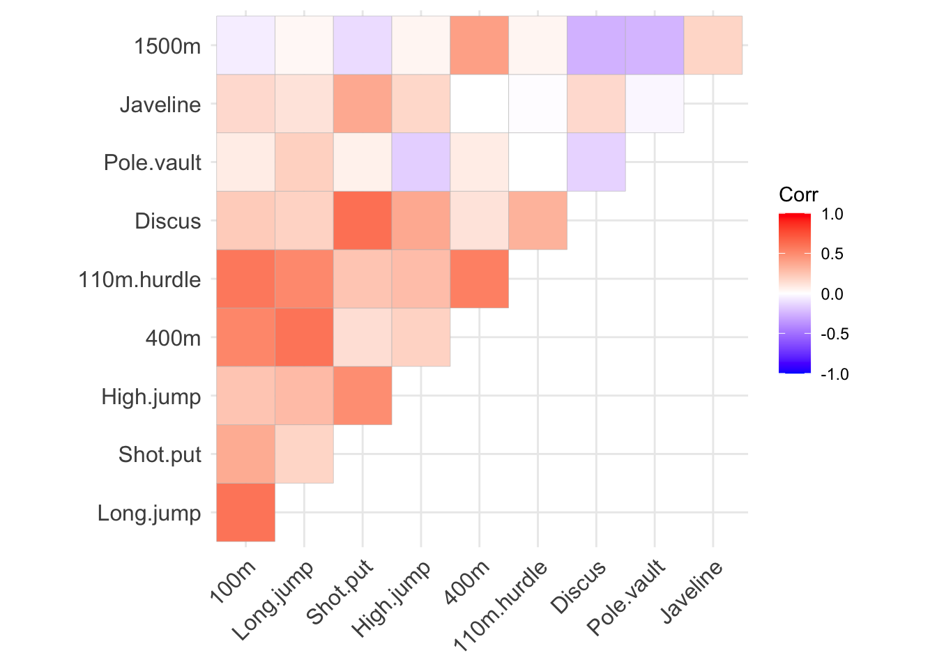
3.2.2 PCA in R
There are multiple implementations of PCA across various R packages (and base R). In this tutorial, the PCA analysis is performed using the PCA() function from the FactoMineR package, with additional visualization tools from factoextra. The command to analyse the decathlon data with PCA is:
dec_pca <- PCA(dec_events, scale.unit = TRUE, ncp = 10, graph = FALSE)Key function arguments:
scale.unit = TRUE(TRUEby default). Setting this toTRUEensures that the input data is centered and scaled, so that each variable (column) has zero mean and variance equal to one. This is important if the input variables are on different measurement scales.ncp = 10. Thencpparameter controls how many principal components are returned by the function. This can be set to any number between 1 and the original dimensionality of the data (in this case 10).graph = FALSE. Setting this toFALSEprevents automatic plotting. We can create this plot on demand at any point.
The dec_pca object contains the following information:
dec_pca**Results for the Principal Component Analysis (PCA)**
The analysis was performed on 41 individuals, described by 10 variables
*The results are available in the following objects:
name description
1 "$eig" "eigenvalues"
2 "$var" "results for the variables"
3 "$var$coord" "coord. for the variables"
4 "$var$cor" "correlations variables - dimensions"
5 "$var$cos2" "cos2 for the variables"
6 "$var$contrib" "contributions of the variables"
7 "$ind" "results for the individuals"
8 "$ind$coord" "coord. for the individuals"
9 "$ind$cos2" "cos2 for the individuals"
10 "$ind$contrib" "contributions of the individuals"
11 "$call" "summary statistics"
12 "$call$centre" "mean of the variables"
13 "$call$ecart.type" "standard error of the variables"
14 "$call$row.w" "weights for the individuals"
15 "$call$col.w" "weights for the variables" 3.2.2.1 What are the Principal Components?
The principal components (new basis vectors) can be accessed using the command dec_pca$svd$V. The term svd stands for Singular Value Decomposition, the matrix factorization technique used by the PCA function to compute the principal components (PCs). In this case, the 10 PCs are represented by the 10 columns of the resulting matrix.
dec_pca$svd$V %>% round(3) [,1] [,2] [,3] [,4] [,5] [,6] [,7] [,8] [,9] [,10]
[1,] 0.428 0.142 -0.156 0.037 -0.365 -0.296 0.382 -0.462 0.105 0.424
[2,] 0.410 0.262 -0.154 0.099 0.044 -0.306 -0.628 -0.021 -0.483 -0.081
[3,] 0.344 -0.454 0.020 0.185 0.134 0.305 0.310 -0.314 -0.427 -0.390
[4,] 0.316 -0.266 0.219 -0.132 0.671 -0.468 0.091 0.125 0.244 0.106
[5,] 0.376 0.432 0.111 -0.029 0.106 0.333 -0.124 -0.213 0.552 -0.414
[6,] 0.413 0.174 -0.078 -0.283 -0.199 0.100 0.357 0.711 -0.150 -0.091
[7,] 0.305 -0.460 -0.036 -0.253 -0.127 0.449 -0.430 0.038 0.155 0.449
[8,] 0.028 0.137 -0.584 0.536 0.399 0.262 0.098 0.178 0.083 0.276
[9,] 0.153 -0.241 0.329 0.693 -0.369 -0.163 -0.107 0.296 0.247 -0.088
[10,] 0.032 0.360 0.660 0.157 0.186 0.298 0.084 -0.014 -0.308 0.429A more intuitive way to understand how the PCs relate to the original variables is through a variable factor map, created using the fviz_pca_var() function from the factoextra package. This visualization displays the correlations between the original variables and the first two PCs.
The arrows in the diagram below represent the strength of the correlation between each variable and the PCs. The angle between any two arrows reflects the degree of correlation between the corresponding variables.
library(factoextra)
fviz_pca_var(dec_pca, axes = c(1, 2), repel = TRUE)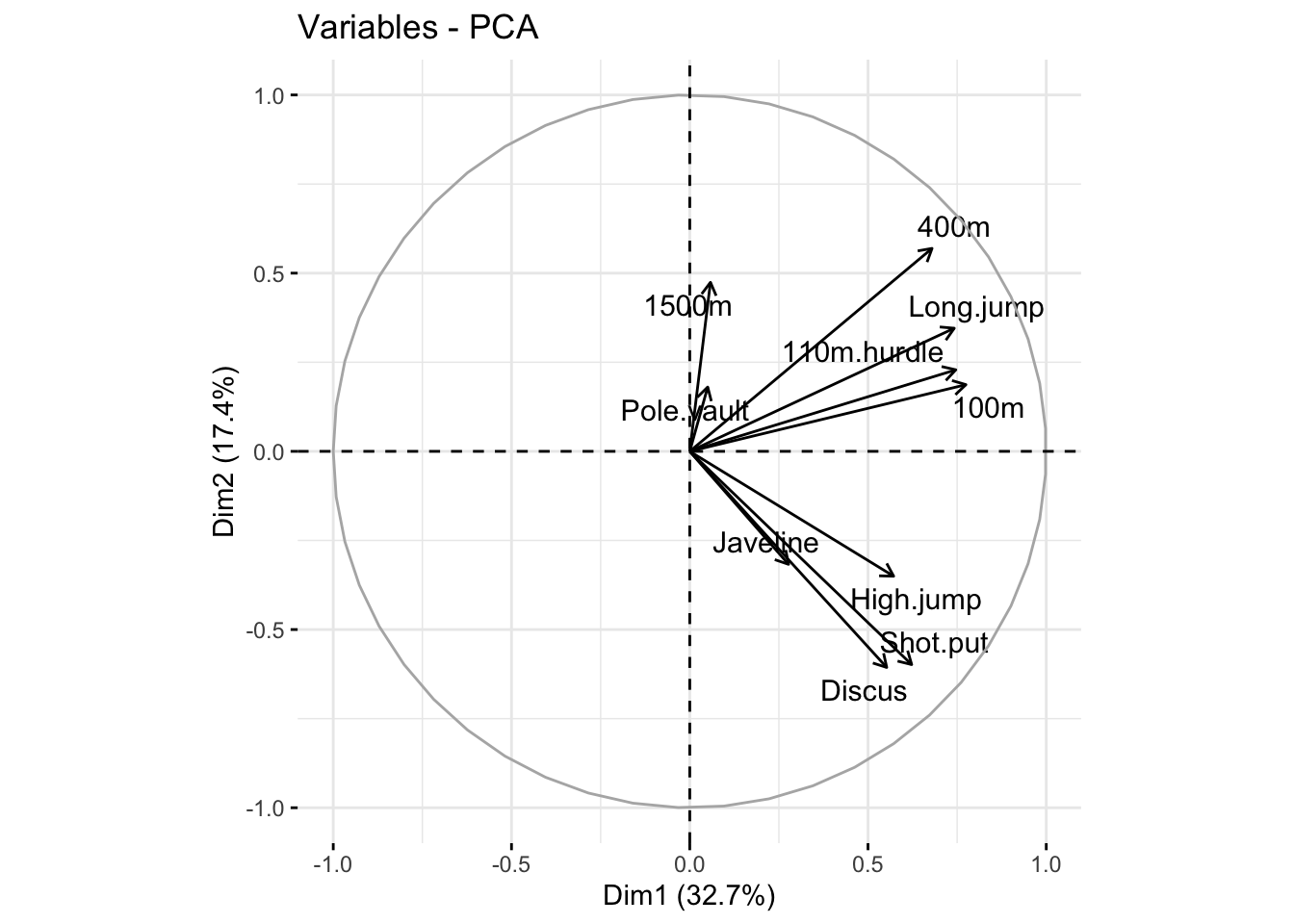
3.2.2.2 Interpreting the Variable Factor Map
The variable factor map of the decathlon data reveals valuable insights about how the events are related and how the PCs summarize the original variables:
Clustering of Variables: Variables that are close together on the plot are highly correlated. For example, the 100m, 110m hurdles, and long jump cluster together, indicating a strong correlation between these events. Similarly, discus, shot put, and high jump form another cluster.
Loading of Variables on PCs: All variables positively load the first principal component (PC1), with all arrows pointing to the right. This suggests that PC1 captures a general measure of decathlon performance across all events in this dataset.
Distinction Between Groups: The second principal component (PC2) is positively correlated with running events and long jump, and negatively correlated with throwing events and high jump. This indicates that PC2 captures variation between athletes who excel in running versus those who excel in throwing events. An athlete’s position along this dimension can provide insights into whether their strengths lie in running or throwing events.
Interpreting Results in Context
It is essential to interpret PCA results within the context of the specific dataset being analyzed (e.g., elite decathletes in this case). The correlation structure observed among event scores in this dataset may not hold for different cohorts or contexts.
Dimensionality reduction methods like PCA can sometimes invite over-interpretation. While PCA can highlight patterns and relationships, it does not provide evidence for causation. For example, the clustering of variables or the loadings on PCs should not be interpreted as definitive explanations of the underlying causes. Such interpretations should always be supported by additional experimental evidence or mechanistic insights.
3.2.2.3 How Does the Data Look In the New Coordinate System?
The data expressed in the new coordinate system can be accessed using the command dec_pca$ind$coord. Below is a preview of the first six observations, rounded to two decimal places:
head(dec_pca$ind$coord) %>% round(2) Dim.1 Dim.2 Dim.3 Dim.4 Dim.5 Dim.6 Dim.7 Dim.8 Dim.9 Dim.10
SEBRLE 0.79 -0.77 -0.83 1.17 0.71 -1.03 -0.55 0.44 0.14 -0.50
CLAY 1.23 -0.57 -2.14 -0.35 -1.97 0.69 -0.71 0.60 0.65 0.27
KARPOV 1.36 -0.48 -1.96 -1.86 0.80 0.73 -0.19 0.25 0.80 -0.52
BERNARD -0.61 0.87 -0.89 2.22 0.36 0.28 0.05 -0.07 0.72 -0.19
YURKOV -0.59 -2.13 1.23 0.87 1.25 -0.10 -0.57 -0.09 0.20 -0.06
WARNERS 0.36 1.68 -0.77 -0.59 1.00 0.03 -0.10 0.30 -0.61 -0.72The function fviz_pca_biplot() generates a scatter plot of the observations in the PC-based coordinate system, with the variable loadings overlaid:
fviz_pca_biplot(dec_pca, axes = c(1, 2), repel = TRUE)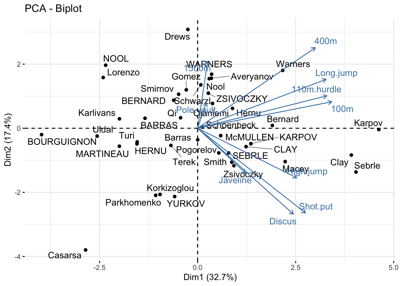
Since all events positively correlate with PC1, it can be interpreted as an “overall ability” score. The three observations with the highest PC1 values are Karpov, Clay, and Sebrle. Examining the original data for these athletes reveals that they comprised the podium at the Olympics:
gt(decathlon[c('Karpov','Clay','Sebrle'), ])| 100m | Long.jump | Shot.put | High.jump | 400m | 110m.hurdle | Discus | Pole.vault | Javeline | 1500m | Rank | Points | Competition |
|---|---|---|---|---|---|---|---|---|---|---|---|---|
| 10.50 | 7.81 | 15.93 | 2.09 | 46.81 | 13.97 | 51.65 | 4.6 | 55.54 | 278.11 | 3 | 8725 | OlympicG |
| 10.44 | 7.96 | 15.23 | 2.06 | 49.19 | 14.13 | 50.11 | 4.9 | 69.71 | 282.00 | 2 | 8820 | OlympicG |
| 10.85 | 7.84 | 16.36 | 2.12 | 48.36 | 14.05 | 48.72 | 5.0 | 70.52 | 280.01 | 1 | 8893 | OlympicG |
Athletes Drews and YURKOV are positioned similarly along PC1 but are opposites along PC2. This suggests they achieve similar “overall” performance through different strengths: Drews excels in the running events and long jump, while YURKOV performs better in the throwing events and high jump. This interpretation is supported by their raw data:
gt(decathlon[c('Drews','YURKOV'), ])| 100m | Long.jump | Shot.put | High.jump | 400m | 110m.hurdle | Discus | Pole.vault | Javeline | 1500m | Rank | Points | Competition |
|---|---|---|---|---|---|---|---|---|---|---|---|---|
| 10.87 | 7.38 | 13.07 | 1.88 | 48.51 | 14.01 | 40.11 | 5.00 | 51.53 | 274.21 | 19 | 7926 | OlympicG |
| 11.34 | 7.09 | 15.19 | 2.10 | 50.42 | 15.31 | 46.26 | 4.72 | 63.44 | 276.40 | 5 | 8036 | Decastar |
It is also useful to examine the correlation between variables in the new coordinate system defined by the principal components. Recall that the chart.correlation() function previously identified correlations in the original dataset. Running the same visualization on the PC-transformed data reveals no correlations between variables, as the PCA algorithm constructs PCs to be uncorrelated:
chart.Correlation(dec_pca$ind$coord)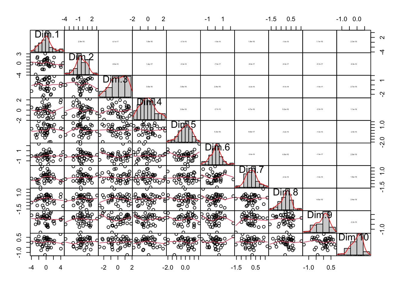
It may be difficult to see in the visualizations above, but the histograms depicting the distributions of observations along each PC axis become narrower from PC1 to PC10. This narrowing occurs because the first PCs capture most of the variance in the data. The values contained in the latter PCs are smaller and contribute little to describing the observations, demonstrating how PCA effectively reduces data dimensionality. The graph below illustrates this more clearly by showing the concentration of variance in the first few PCs:
library(ggridges)
library(reshape2)
melt(dec_pca$ind$coord) %>%
  ggplot(aes(x = value, y = Var2)) +
  geom_density_ridges(stat = "binline", bins = 30) +
  geom_vline(aes(xintercept = 0), linetype = 'dashed') +
  theme_bw() + xlab('Distribution of observations on each PC axes') + ylab('PC') +
  scale_y_discrete(limits=rev)
3.2.2.4 How Much Can the Dimensionality of the Data Be Reduced?
3.2.2.4.1 Variance Explained by Principal Components
The amount of variance captured by each principal component (PC) can be accessed using the command:
dec_pca$eig eigenvalue percentage of variance cumulative percentage of variance
comp 1 3.2719055 32.719055 32.71906
comp 2 1.7371310 17.371310 50.09037
comp 3 1.4049167 14.049167 64.13953
comp 4 1.0568504 10.568504 74.70804
comp 5 0.6847735 6.847735 81.55577
comp 6 0.5992687 5.992687 87.54846
comp 7 0.4512353 4.512353 92.06081
comp 8 0.3968766 3.968766 96.02958
comp 9 0.2148149 2.148149 98.17773
comp 10 0.1822275 1.822275 100.00000This output shows that the first PC captures 32.7% of the variance, the second captures 17.3%, and so on. The cumulative sum column indicates that approximately 50% of the total variance in the data will be retained if only the first two PCs are used to represent the observations (reducing dimensionality from 10 to 2).
A scree plot, which visualizes the variance explained by each PC, can be generated with the following command:
fviz_eig(dec_pca, addlabels = TRUE)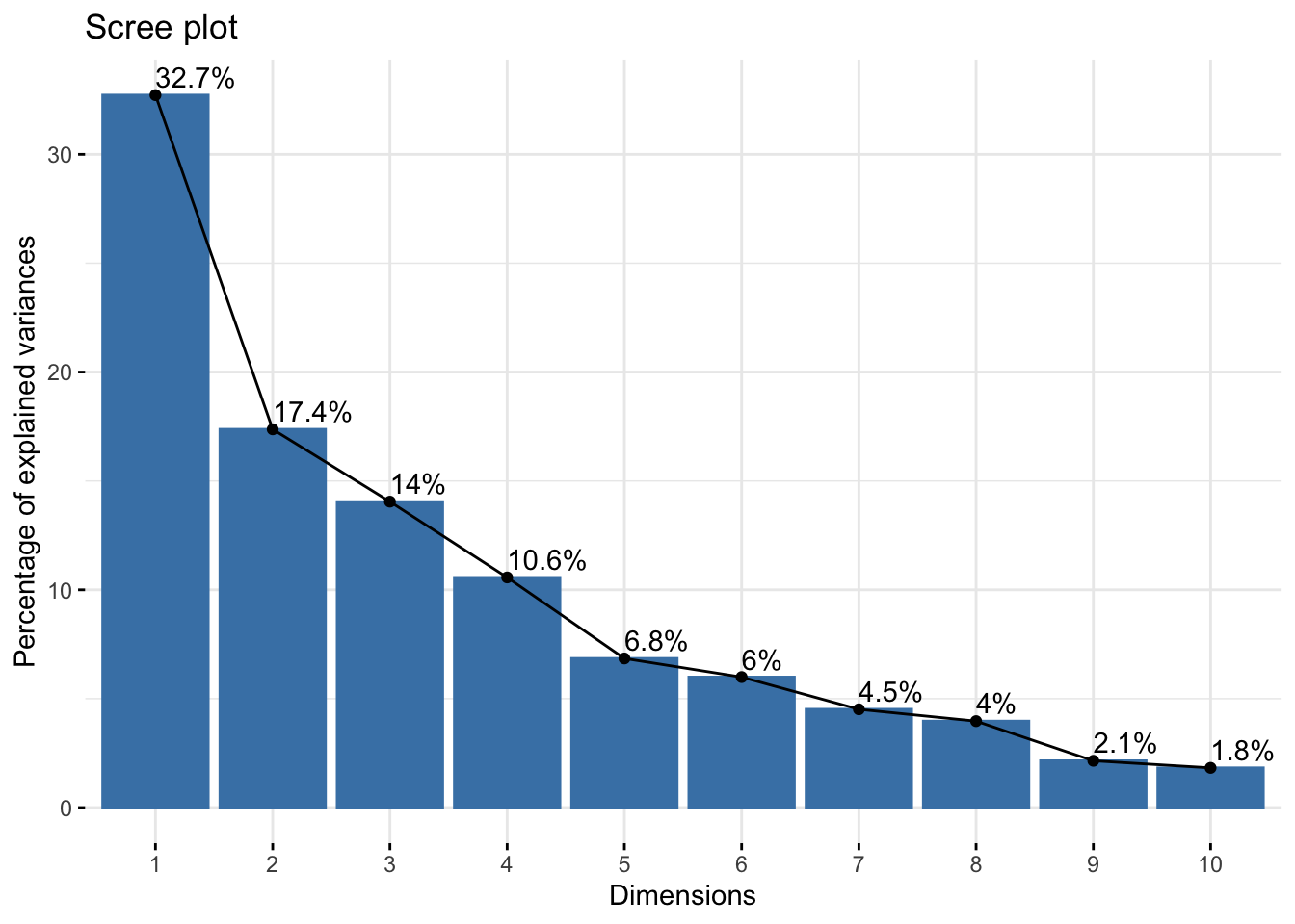
3.2.2.4.2 Exploring Variance Explained
The concept of variance explained warrants deeper exploration. To understand this, we can project the data into the PC coordinate system, retain only a subset of PCs, and then reconstruct the original data.
If we use only the first two PCs, the data matrix will have dimensions \(41 \times 2\), and we will have two basis vectors of length 10 (corresponding to the first two PCs). By multiplying these, we obtain a reconstructed dataset. However, since 8 PCs have been discarded, some information will inevitably be lost.
The equation below represents the reconstructed dataset, \(\mathcal{D}_{reconstructed}\), using only the first two PCs:
\[ \begin{split} \mathcal{D}_{reconstructed} &= \begin{bmatrix} 0.79 & -0.72 \\ 1.24 & -0.58 \\ 1.36 & -0.48 \\ -0.61 & 0.875 \\ -0.59 & -2.13 \\ 0.36 & 1.69 \\ ... & ... \end{bmatrix} \times \begin{bmatrix} 0.43 & 0.41 & 0.34 & 0.32 & 0.38 & 0.41 & 0.31 & 0.03 & 0.15 & 0.03 \\ 0.14 & 0.26 & -0.45 & -0.27 & 0.43 & 0.17 & -0.46 & 0.14 & -0.24 & 0.36 \\ \end{bmatrix} \\ &= \begin{bmatrix} 0.229 & 0.122 & 0.623 & 0.455 & -0.036 & 0.193 & 0.597 & -0.084 & 0.307 & -0.252 \\ 0.447 & 0.356 & 0.686 & 0.543 & 0.216 & 0.41 & 0.642 & -0.044 & 0.327 & -0.167 \\ 0.513 & 0.43 & 0.687 & 0.558 & 0.301 & 0.476 & 0.637 & -0.028 & 0.324 & -0.131 \\ -0.137 & -0.021 & -0.607 & -0.425 & 0.149 & -0.1 & -0.589 & 0.103 & -0.304 & 0.295 \\ -0.554 & -0.799 & 0.766 & 0.381 & -1.141 & -0.612 & 0.801 & -0.308 & 0.423 & -0.786 \\ 0.392 & 0.588 & -0.642 & -0.335 & 0.862 & 0.44 & -0.666 & 0.241 & -0.351 & 0.618 \\ ... & ... & ... & ... & ... & ... & ... & ... & ... & ... \\ \end{bmatrix} \end{split} \] While these reconstructed values differ from the original data, recall that PCA preprocesses the data by centering (zero mean) and scaling (unit variance). To return to the original scale, we must reverse these operations by multiplying by the original standard deviations and adding the means.
# Reconstructed dataset using only the first two PCs
recon <- dec_pca$ind$coord[, 1:2] %*% t(dec_pca$svd$V[, 1:2])

# Standard deviations of the original data
dec_sds <- apply(dec_events, 2, sd)

# Re-scaling each column back to the original units
recon_scaled <- recon
for (i in 1:10){
  recon_scaled[, i] = recon[, i] * dec_sds[i] + dec_pca$call$centre[i]
}

# Display the reconstructed data
head(recon_scaled) %>% round (2)
[,1] [,2] [,3] [,4] [,5] [,6] [,7] [,8] [,9] [,10]
SEBRLE -10.94 7.30 14.99 2.02 -49.66 -14.51 46.34 4.74 59.80 -281.97
CLAY -10.88 7.37 15.04 2.03 -49.37 -14.41 46.49 4.75 59.90 -280.98
KARPOV -10.86 7.40 15.04 2.03 -49.27 -14.38 46.48 4.75 59.88 -280.55
BERNARD -11.03 7.25 13.98 1.94 -49.44 -14.65 42.34 4.79 56.85 -275.58
YURKOV -11.14 7.01 15.11 2.01 -50.93 -14.89 47.03 4.68 60.36 -288.19
WARNERS -10.89 7.45 13.95 1.95 -48.62 -14.40 42.08 4.83 56.62 -271.813.2.2.4.3 Observing Reconstructed Data
The rescaled reconstructed data aligns closely with what we expect for decathlon results. We can see that each athlete has realistic scores for each of the 10 events, even though we only used 2 of the PCs:
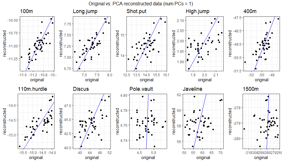
\[ \begin{bmatrix} -10.94 & 7.3 & 14.99 & 2.02 & -49.66 & -14.51 & 46.34 & 4.74 & 59.8 & -281.97 \\ -10.88 & 7.37 & 15.04 & 2.03 & -49.37 & -14.41 & 46.49 & 4.75 & 59.9 & -280.98 \\ -10.86 & 7.4 & 15.04 & 2.03 & -49.27 & -14.38 & 46.48 & 4.75 & 59.88 & -280.55 \\ -11.03 & 7.25 & 13.98 & 1.94 & -49.44 & -14.65 & 42.34 & 4.79 & 56.85 & -275.58 \\ -11.14 & 7.01 & 15.11 & 2.01 & -50.93 & -14.89 & 47.03 & 4.68 & 60.36 & -288.19 \\ -10.89 & 7.45 & 13.95 & 1.95 & -48.62 & -14.4 & 42.08 & 4.83 & 56.62 & -271.81 \\ ... & ... & ... & ... & ... & ... & ... & ... & ... & ... \\ \end{bmatrix} \] The gif below illustrates how faithfully the data can be reconstructed using anywhere from 1 to 10 PCs. Around 4-5 PCs are sufficient to align the reconstructed data closely with the original observations. This aligns with the PCA results, where the first 4 PCs captured ~75% of the variance, and the first 5 captured ~80%.
3.2.2.4.4 Comparison with Standard Basis Vectors
Using only the first two standard basis vectors instead of PCs highlights the advantage of PCA. The reconstructed dataset would retain information only for the first two events, losing all information about the remaining eight:
\[ \begin{split} \mathcal{D}_{reconstructed} &= \begin{bmatrix} -11.04 & 7.58 \\ -10.76 & 7.4 \\ -11.02 & 7.3 \\ -11.02 & 7.23 \\ -11.34 & 7.09 \\ -11.11 & 7.6 \\ ... & ... \end{bmatrix} \times \begin{bmatrix} 1 & 0 & 0 & 0 & 0 & 0 & 0 & 0 & 0 & 0 \\ 0 & 1 & 0 & 0 & 0 & 0 & 0 & 0 & 0 & 0 \\ \end{bmatrix} \\ &= \begin{bmatrix} -11.04 & 7.58 & 0 & 0 & 0 & 0 & 0 & 0 & 0 & 0 \\ -10.76 & 7.4 & 0 & 0 & 0 & 0 & 0 & 0 & 0 & 0 \\ -11.02 & 7.3 & 0 & 0 & 0 & 0 & 0 & 0 & 0 & 0 \\ -11.02 & 7.23 & 0 & 0 & 0 & 0 & 0 & 0 & 0 & 0 \\ -11.34 & 7.09 & 0 & 0 & 0 & 0 & 0 & 0 & 0 & 0 \\ -11.11 & 7.6 & 0 & 0 & 0 & 0 & 0 & 0 & 0 & 0 \\ ... & ... & ... & ... & ... & ... & ... & ... & ... & ... \\ \end{bmatrix} \end{split} \] This starkly demonstrates how PCA excels in capturing the most meaningful patterns in the data while reducing dimensionality effectively.
3.2.2.5 How Many Principal Components Should Be Retained?
Determining the number of principal components (PCs) to retain is a common question after performing a PCA. There is no universal answer, as the choice depends on the purpose of the analysis and the context of the data.
3.2.2.5.1 Purpose-Driven Retention
The meaning of retained depends on the analytical context:
Pre-processing for Secondary Analysis: When PCA is used as a pre-processing step (e.g., for clustering or regression), retained refers to the number of PCs passed into the secondary method. In such cases, selecting the number of PCs is crucial for maintaining model performance while reducing dimensionality.
Exploratory or Descriptive Analysis: For exploratory purposes, retained may refer to:
- The number of PCs visualized in variable factor maps.
- The PCs interpreted using their loadings on the original variables. In such cases, additional PCA outputs like scree plots are often presented for all components, providing a complete overview.
3.2.2.5.2 Common Retention Criteria
A widely used approach is to set a threshold for total variance explained (e.g., 80%, 90%, or 95%) and retain enough PCs to meet or exceed this threshold. This method balances dimensionality reduction with preserving information.
In predictive modeling pipelines, the optimal number of PCs can be determined by evaluating performance across different choices using techniques like cross-validation. This ensures the retained components contribute meaningfully to the model.
3.2.2.5.3 Context Matters
Ultimately, deciding how many PCs to retain requires careful consideration of the specific objectives and the dataset characteristics. What works for one analysis may not suit another, so flexibility and domain knowledge are key to making an informed choice.
3.3 Factor Analysis
Factor analysis is not merely a dimensionality reduction method; it also serves as a robust framework for uncovering latent variables and has a long history of application in various fields, particularly psychology.
3.3.1 How is Factor Analysis Different from PCA?
The most fundamental difference is that factor analysis explicitly specifies a model relating the observed variables to a smaller set of underlying unobservable factors. Although some authors express PCA in the framework of a model, its main application is as a descriptive, exploratory technique, with no thought of an underlying model. This descriptive nature means that distributional assumptions are unnecessary to apply PCA in its usual form.
(For more information see: Brunner, University of Toronto)
3.3.2 Factor Analysis Model
In exploratory factor analysis, the goal is to describe and summarize a dataset by explaining a set of observed variables in terms of a smaller number of unobservable latent variables, called factors. The underlying assumption is that the factors are responsible for the correlations observed between the variables.
Each observed variable is modeled as a linear combination of the latent factors, along with an error term (specific to that variable). For instance, if a dataset has six observed variables (\(x_1, x_2, ..., x_6\)), and these are believed to be driven by two latent factors (\(F_{1} \text{ and } F_{2}\)), the model is expressed as:
\[ \begin{split} \textcolor{green}{x_{i,1}} &= \textcolor{blue}{\lambda_{11}} \textcolor{red}{F_{i,1}} + \textcolor{blue}{\lambda_{12}} \textcolor{red}{F_{i,2}} + \epsilon_1 \\ \textcolor{green}{x_{i,2}} &= \textcolor{blue}{\lambda_{21}} \textcolor{red}{F_{i,1}} + \textcolor{blue}{\lambda_{22}} \textcolor{red}{F_{i,2}} + \epsilon_1 \\ &... \\ \textcolor{green}{x_{i,6}} &= \textcolor{blue}{\lambda_{61}} \textcolor{red}{F_{i,1}} + \textcolor{blue}{\lambda_{62}} \textcolor{red}{F_{i,2}} + \epsilon_1 \\ \end{split} \]
To clarify, each equation represents an observed variable as a weighted sum of the latent factors plus an error term:
\[ \begin{split} \text{\textcolor{green}{Person i's score for x1}} &= \text{\textcolor{blue}{Loading of Factor 1 on x1}} \times \text{\textcolor{red}{Person i's score on Factor 1}} \\ & \qquad \qquad + \text{\textcolor{blue}{Loading of Factor 2 on x1}} \times \text{\textcolor{red}{Person i's score on Factor 2}} \\ & \qquad \qquad \qquad \qquad + \text{error for Person i on x1} \end{split} \] Using matrix notation, the model becomes:
\[ \begin{bmatrix} x_{i,1} \\ x_{i,2} \\ x_{i,3} \\ x_{i,4} \\ x_{i,5} \\ x_{i,6} \\ \end{bmatrix} = \begin{bmatrix} \lambda_{11} & \lambda_{12} \\ \lambda_{21} & \lambda_{22} \\ \lambda_{31} & \lambda_{32} \\ \lambda_{41} & \lambda_{42} \\ \lambda_{51} & \lambda_{52} \\ \lambda_{61} & \lambda_{62} \\ \end{bmatrix} \times \begin{bmatrix} F_{i,1} \\ F_{i,2} \\ \end{bmatrix} + \begin{bmatrix} \epsilon_1 \\ \epsilon_2 \\ \epsilon_3 \\ \epsilon_4 \\ \epsilon_5 \\ \epsilon_6 \\ \end{bmatrix} \]
Here:
- The \(\lambda\) matrix represents the loadings of each factor on the observed variables.
- The \(F\) vector contains the scores of individual \(i\) on the factors.
- The \(\epsilon\) vector captures the residual variance for each observed variable.
This framework achieves dimensionality reduction because the six-dimensional observed data (\(x_{i,1}, x_{i,2}, ..., x_{i,6}\)) is effectively represented by the two-dimensional latent factors (\(F_{i,1}, F_{i,2}\)).
3.3.3 Factor Analysis in R
Factor analysis can be performed in R using several packages and functions. For this tutorial, we will use the psych package, which offers extensive functionality. For a comprehensive guide to its capabilities, refer to the package documentation. Note that base R includes the factanal() function, which employs different default estimation methods. While the results may differ, they can be aligned with those from the fa() function in psych by adjusting parameters. More details can be found here.
library(psych)3.3.3.1 Key Choices in Factor Analysis
Performing factor analysis requires making several key decisions. The fa() function in the psych package includes the following important parameters:
nfactors: The number of factors to extract (default is 1).rotate: The rotation method to apply to the factors (e.g., oblimin by default).fm: The method to optimize the factor analysis solution (default is minres).
The choice of the number of factors has the most significant impact on the results. Similar to PCA, there are multiple approaches to determine this number. In the absence of domain knowledge, one method is to create a scree plot overlaid with a scree plot from a random data matrix of the same size. The number of factors before the lines cross is a recommended starting point.
A parallel analysis, which compares eigenvalues of the observed data to those from random data, can be performed using the fa.parallel() function in the psych package.
3.3.3.2 Applying Factor Analysis to the Decathlon Data
Below is the code to perform a parallel analysis on the decathlon dataset:
dec_pa <- fa.parallel(
  dec_events,
  nfactors = 4, # A choice is still required to create the scree plot (use domain knowledge to set a reasonable value)
  fa='fa'
  )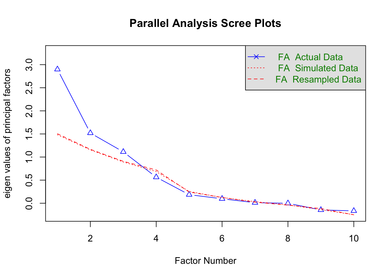
Parallel analysis suggests that the number of factors = 3 and the number of components = NA The analysis shows that three factors have eigenvalues above the simulated data line, suggesting that a three-factor solution may be appropriate. This can be estimated using the fa() function:
dec_fa <- fa(dec_events,
             nfactors = 3,
             fm = 'ml',
             rotate = 'oblimin')
3.3.3.3 Interpreting the Results
The output of fa() contains valuable information:
- Factor Loadings: The columns (ML3, ML2, and ML1) describe how each observed variable relates to the latent factors. This corresponds to the \(\mathbf{\lambda}\) matrix in the factor analysis model.
- Communality (h2): The proportion of each variable’s variance explained by the retained factors.
- Uniqueness (u2): The proportion of variance unique to each variable, not explained by the factors.
dec_faFactor Analysis using method = ml
Call: fa(r = dec_events, nfactors = 3, rotate = "oblimin", fm = "ml")
Standardized loadings (pattern matrix) based upon correlation matrix
ML3 ML2 ML1 h2 u2 com
100m 0.71 0.14 -0.14 0.589 0.411 1.2
Long.jump 0.79 -0.04 -0.09 0.604 0.396 1.0
Shot.put -0.01 0.95 0.02 0.894 0.106 1.0
High.jump 0.15 0.49 0.09 0.303 0.697 1.3
400m 0.78 -0.05 0.29 0.736 0.264 1.3
110m.hurdle 0.69 0.07 -0.05 0.509 0.491 1.0
Discus 0.10 0.60 -0.19 0.466 0.534 1.3
Pole.vault 0.19 -0.07 -0.28 0.093 0.907 1.9
Javeline -0.11 0.45 0.26 0.215 0.785 1.7
1500m 0.02 0.00 1.00 0.995 0.005 1.0
ML3 ML2 ML1
SS loadings 2.35 1.78 1.28
Proportion Var 0.23 0.18 0.13
Cumulative Var 0.23 0.41 0.54
Proportion Explained 0.43 0.33 0.24
Cumulative Proportion 0.43 0.76 1.00
With factor correlations of
ML3 ML2 ML1
ML3 1.00 0.30 0.13
ML2 0.30 1.00 -0.14
ML1 0.13 -0.14 1.00
Mean item complexity = 1.3
Test of the hypothesis that 3 factors are sufficient.
df null model = 45 with the objective function = 3.72 with Chi Square = 133.24
df of the model are 18 and the objective function was 0.53
The root mean square of the residuals (RMSR) is 0.06
The df corrected root mean square of the residuals is 0.1
The harmonic n.obs is 41 with the empirical chi square 13.84 with prob < 0.74
The total n.obs was 41 with Likelihood Chi Square = 17.97 with prob < 0.46
Tucker Lewis Index of factoring reliability = 1.001
RMSEA index = 0 and the 90 % confidence intervals are 0 0.14
BIC = -48.87
Fit based upon off diagonal values = 0.96
Measures of factor score adequacy
ML3 ML2 ML1
Correlation of (regression) scores with factors 0.93 0.95 1.00
Multiple R square of scores with factors 0.86 0.91 0.99
Minimum correlation of possible factor scores 0.73 0.82 0.99The second table in the output provides information about the overall variance accounted for by each factor.
The third table summarizes the correlations between factors. For the decathlon data, these correlations are non-zero, indicating relationships among the extracted factors. This highlights a key difference between factor analysis and PCA: PCA always returns uncorrelated components, whereas factor analysis does not necessarily enforce this constraint. If desired, a rotation method can be chosen to produce uncorrelated factors; however, such a solution is not always required or desirable, as it depends on the context of the analysis.
3.3.3.4 Visualizing Factor Loadings
A diagram of the factor loadings can be generated using the fa.diagram() function:
fa.diagram(dec_fa)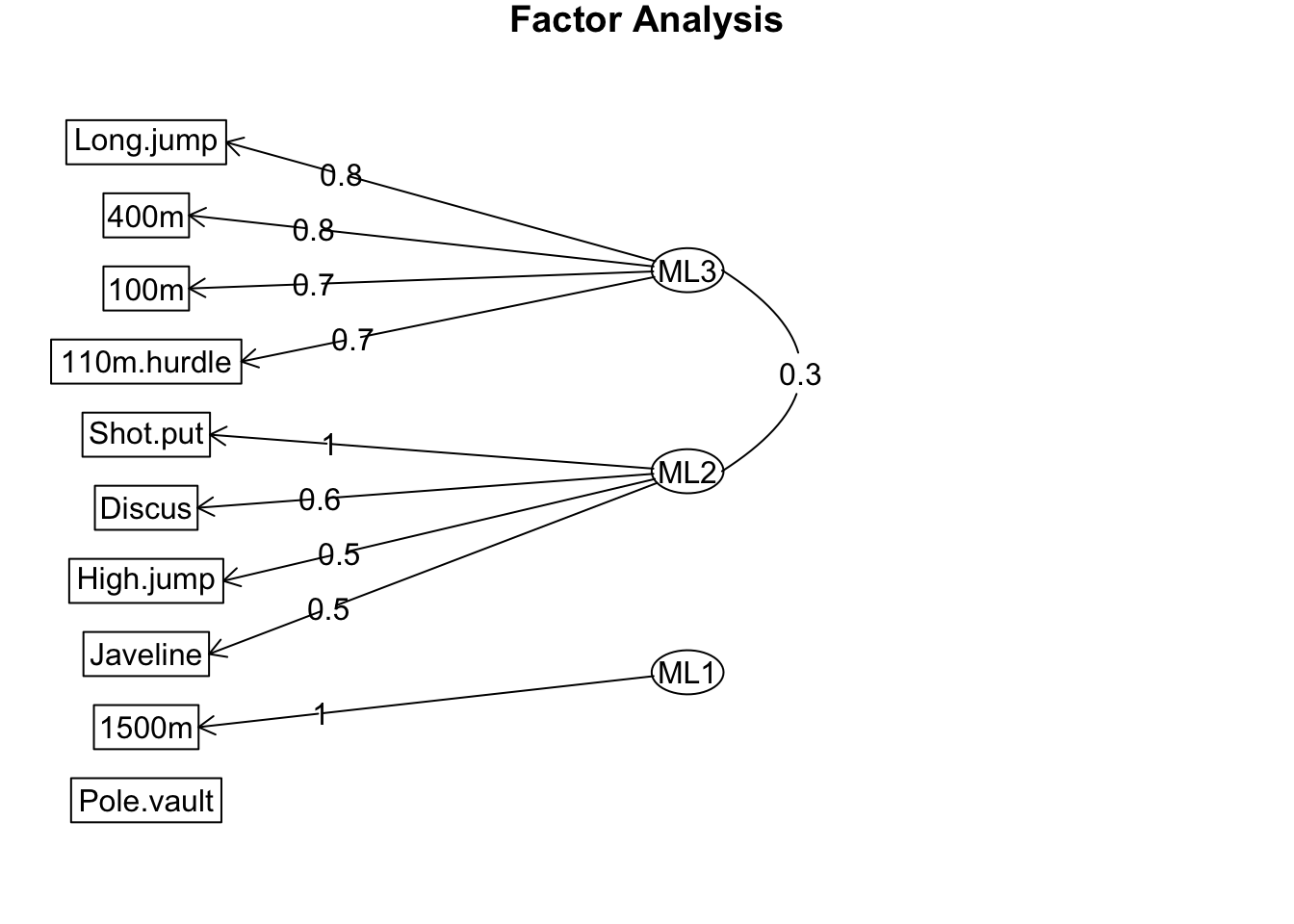
The diagram generated by fa.diagram() summarizes the three-factor solution. Arrows represent the relationships between observed variables and latent factors, with small factor loadings omitted for clarity.
In this case:
- One latent factor is strongly associated with sprint and long jump performance.
- Another is linked to throwing and high jump performance.
- The third primarily loads onto the 1500m event.
No arrows are shown connecting the estimated factors to pole vault performance. This does not imply that the model ignores pole vault data but rather indicates that no single factor has a loading greater than 0.3 (the default threshold in fa.diagram()).
By lowering the cut-off to 0.2, we observe that pole vault performance is most strongly (albeit negatively) loaded onto the same factor as the 1500m event.
fa.diagram(dec_fa, cut = 0.2)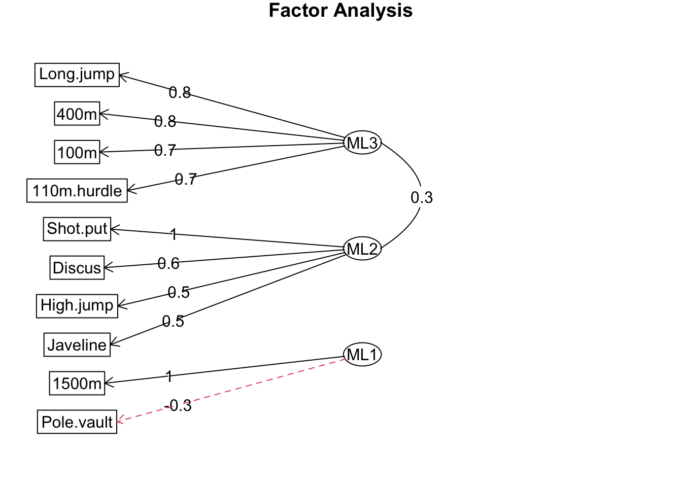
3.3.3.5 Contextual Interpretation
The meaningful interpretation of factors relies on domain knowledge and supporting evidence. For example, latent factors in this dataset may correspond to athletic abilities, physiological characteristics, or anthropometric traits. These insights should be grounded in experimental or observational research.
3.3.3.6 Non-identifiability and Rotations
In factor analysis, the ability to choose different rotation methods stems from the concept of non-identifiability. This means there are multiple possible ‘directions’ the factors can take that provide the same quality of fit to the data. Unlike PCA, where the principal components are explicitly defined as the directions of maximal variance and are constrained to be orthogonal (zero correlation), factor analysis allows flexibility in the orientation of the factors.
The purpose of factor rotation is to enhance interpretability by simplifying the relationships between factors and observed variables. This is typically achieved by ensuring each factor loads primarily on a distinct subset of variables, avoiding solutions with multiple small or diffuse loadings.
The two main types of rotation are:
- Orthogonal Rotation: Produces uncorrelated factors.
- Oblique Rotation: Allows the factors to be correlated.
The default choice in the fa() function from the psych package is oblimin, an oblique rotation. This is often preferred as it imposes fewer restrictions and is well-suited for cases where the underlying latent traits are expected to be correlated.
Caution
All analysis methods have limitations, and factor analysis is no exception. Misinterpretation can arise if results are not carefully evaluated. Dimensionality reduction methods, including factor analysis, require thorough thinking, verification, and caution in interpretation.
4 Conclusion and Reflection
In this lesson, we explored the foundational concepts and practical applications of dimensionality reduction, a powerful technique for simplifying high-dimensional data while retaining its most critical information. From understanding vectors and matrices to implementing methods like PCA and Factor Analysis in R, we delved into the mathematical principles and practical workflows that underpin these techniques.
We examined how dimensionality reduction can uncover patterns, reduce redundancy, and enhance interpretability, particularly in datasets common to sports science. The analyses highlighted the importance of thoughtful preprocessing, careful selection of components or factors, and the contextual interpretation of results to ensure meaningful insights.
As you apply these dimensionality reduction techniques to your own data, you’ll discover their potential to streamline analyses, uncover latent structures, and support more informed decision-making. By mastering these skills, you are not only advancing your technical proficiency but also paving the way for innovative applications in sport science and beyond.
5 Knowledge Spot-Check
What is the primary goal of dimensionality reduction in data analysis
A) To reduce the size of datasets for storage purposes.
B) To simplify data representation while retaining its key information.
C) To improve the visual appearance of data.
D) To remove noise from data entirely
Expand to see the correct answer.
A) To reduce the size of datasets for storage purposes.
B) To simplify data representation while retaining its key information.
C) To improve the visual appearance of data.
D) To remove noise from data entirely
Expand to see the correct answer.
The correct answer is B) To simplify data representation while retaining its key information.
What is the main difference between PCA and Factor Analysis?
A) PCA focuses on maximizing variance, while Factor Analysis models relationships between observed variables and latent factors.
B) PCA is model-based, while Factor Analysis is descriptive.
C) PCA requires normally distributed data, while Factor Analysis does not.
D) PCA results in correlated components, while Factor Analysis ensures orthogonal factors.
Expand to see the correct answer.
The correct answer is A) PCA focuses on maximizing variance, while Factor Analysis models relationships between observed variables and latent factors.
Why is standardizing data important before applying PCA?
A) To make computations faster.
B) To ensure that all variables contribute equally to the analysis, regardless of scale.
C) To eliminate outliers from the data.
D) To avoid dimensionality reduction entirely.
Expand to see the correct answer.
A) To make computations faster.
B) To ensure that all variables contribute equally to the analysis, regardless of scale.
C) To eliminate outliers from the data.
D) To avoid dimensionality reduction entirely.
Expand to see the correct answer.
The correct answer is B) To ensure that all variables contribute equally to the analysis, regardless of scale.
What does a scree plot display in PCA?
A) The distribution of variables.
B) The correlations between original variables.
C) The variance explained by each principal component.
D) The accuracy of PCA predictions.
Expand to see the correct answer.
A) The distribution of variables.
B) The correlations between original variables.
C) The variance explained by each principal component.
D) The accuracy of PCA predictions.
Expand to see the correct answer.
The correct answer is C) The variance explained by each principal component.
What type of rotation is most commonly used in Factor Analysis to allow correlated factors?
A) Varimax
B) None, Factor Analysis does not allow correlated factors.
C) Orthogonal
D) Oblimin
Expand to see the correct answer.
A) Varimax
B) None, Factor Analysis does not allow correlated factors.
C) Orthogonal
D) Oblimin
Expand to see the correct answer.
The correct answer is D) Oblimin.